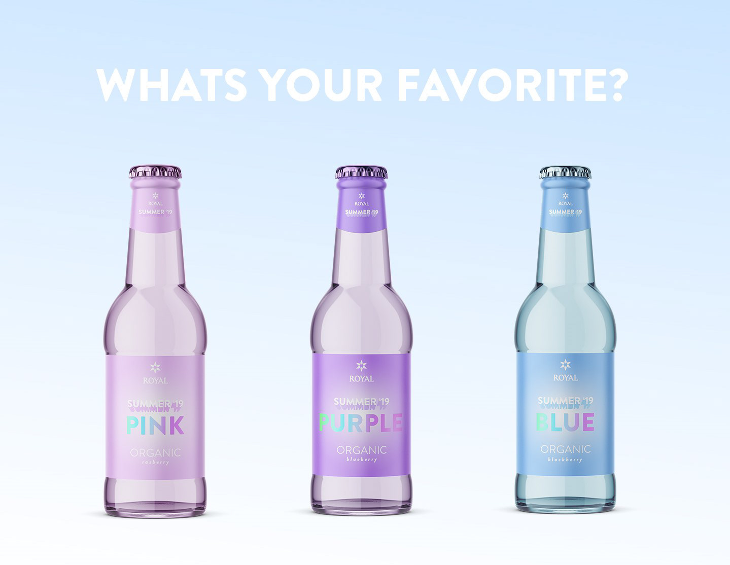
This is a passion projects
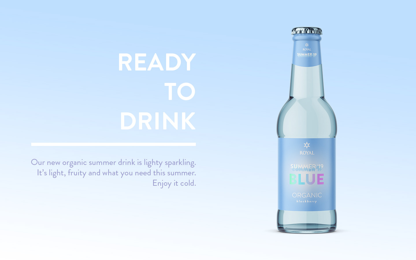
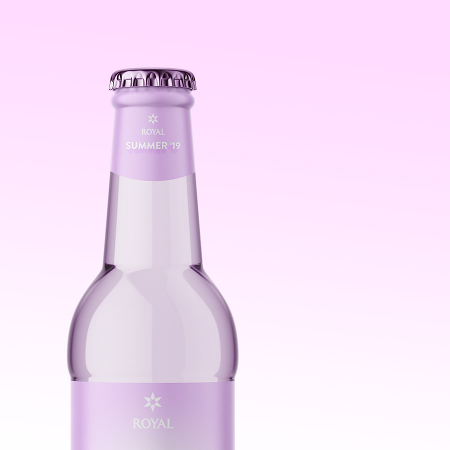
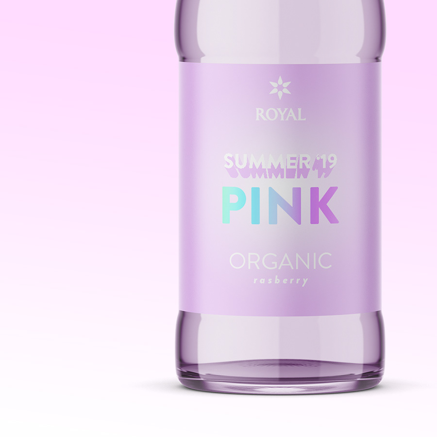
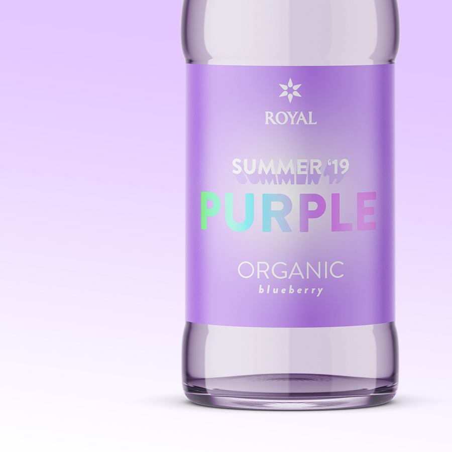
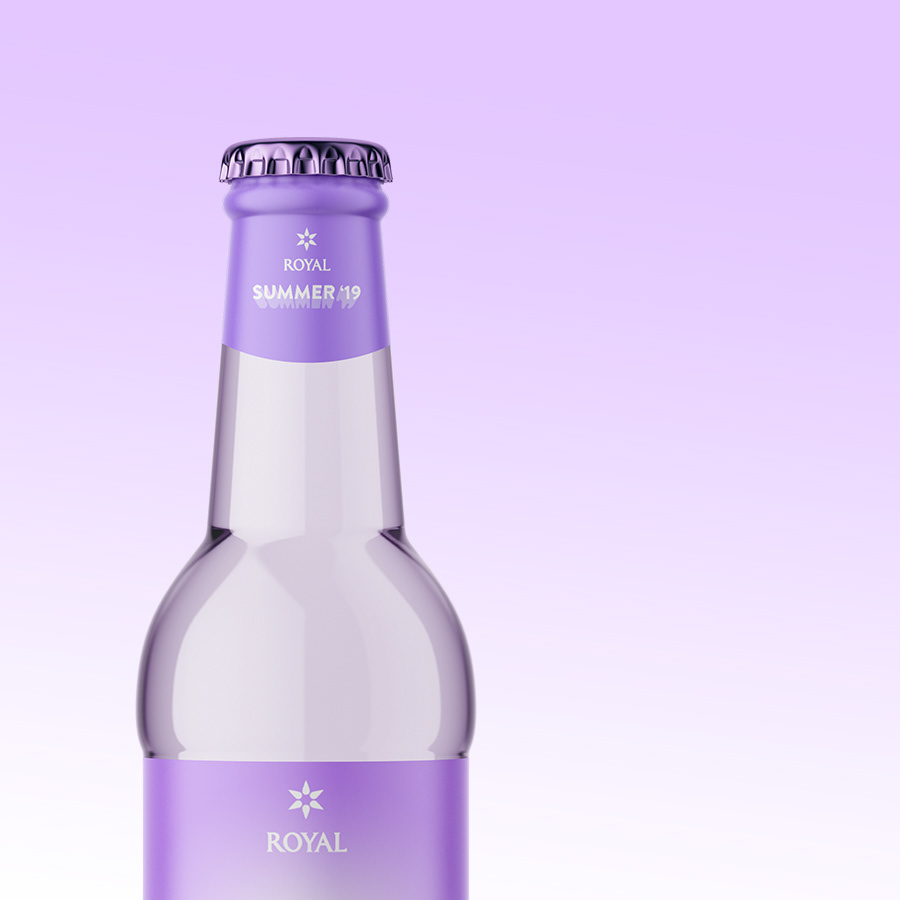
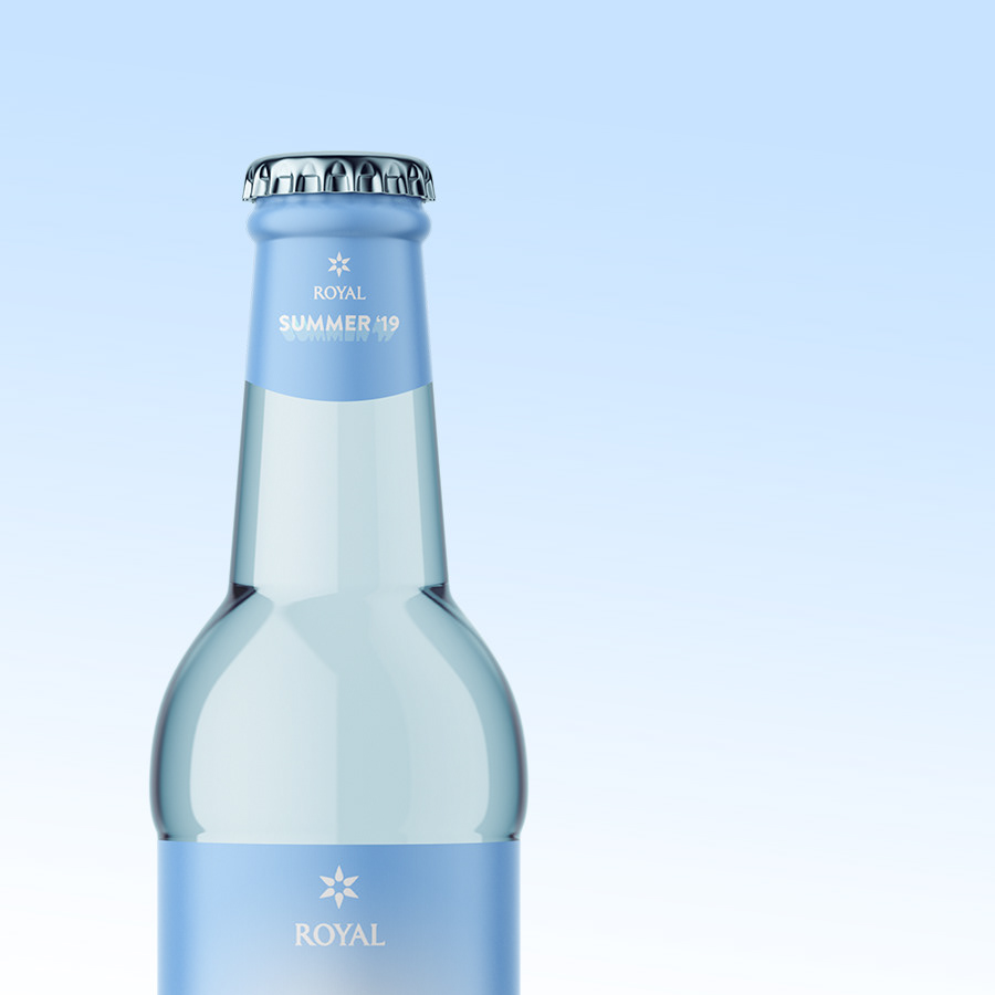
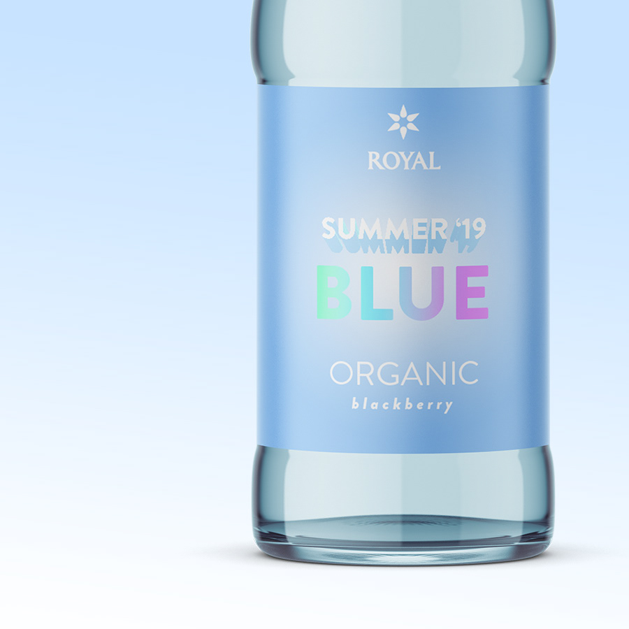
I've designed a seasonal summer 19' drink for ROYAL. My thoughts was make a cool bottle to look at that should follow some graphic trends, to make it attractive for young people to share on SoMe. So, pastels are everywhere. Three colours we see often these days are pink, purple and blue so I've designed a transparent colorued glass bottel with matching labels. The name of the drink is visualised with a holographic font. Holographic visuals is very popular since 2018 and is now a mainstream trend. The big label has a gradient colour effect - gradience is also seen a lot - to create depth. The label below the cap has a solid colour for variation and harmony.