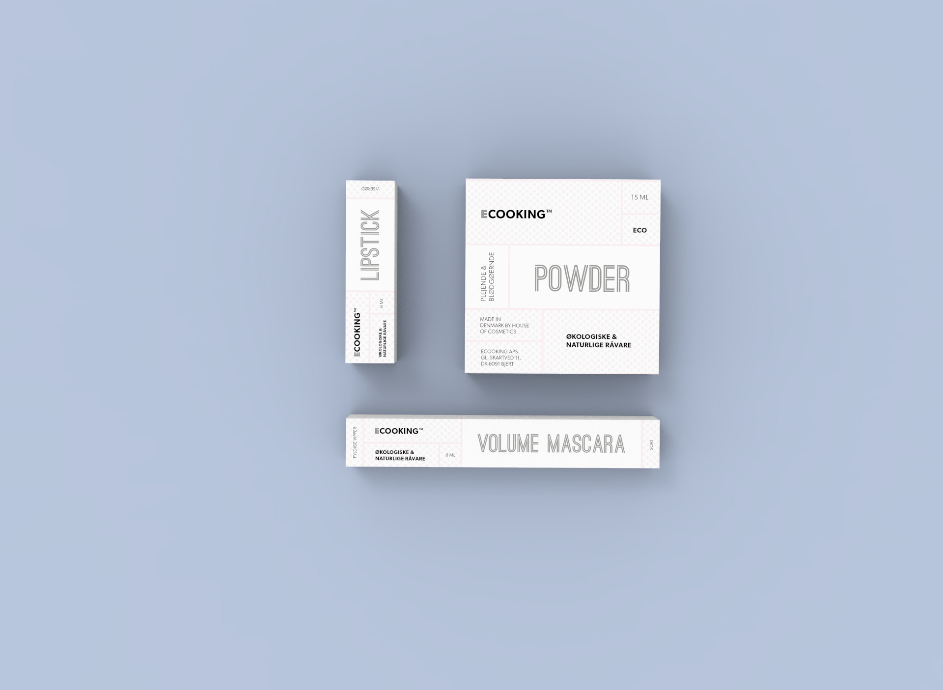
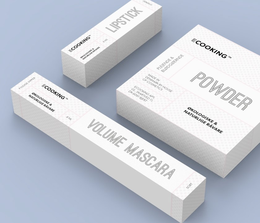
I worked for Eccoking as the Graphic Designer and made several unique packaging design solutions, art directed visual concepts and designed other visual elements. Take a look.
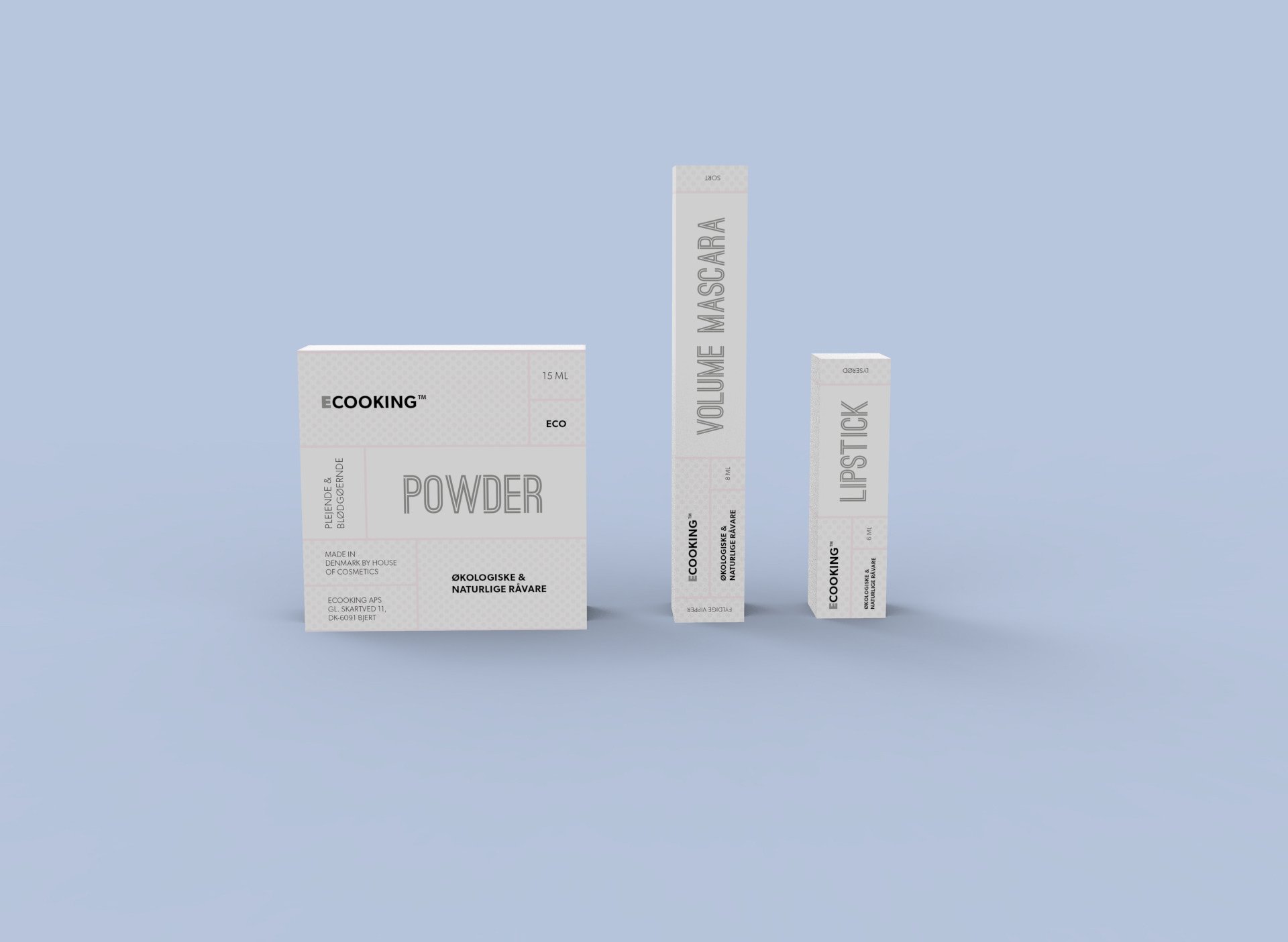
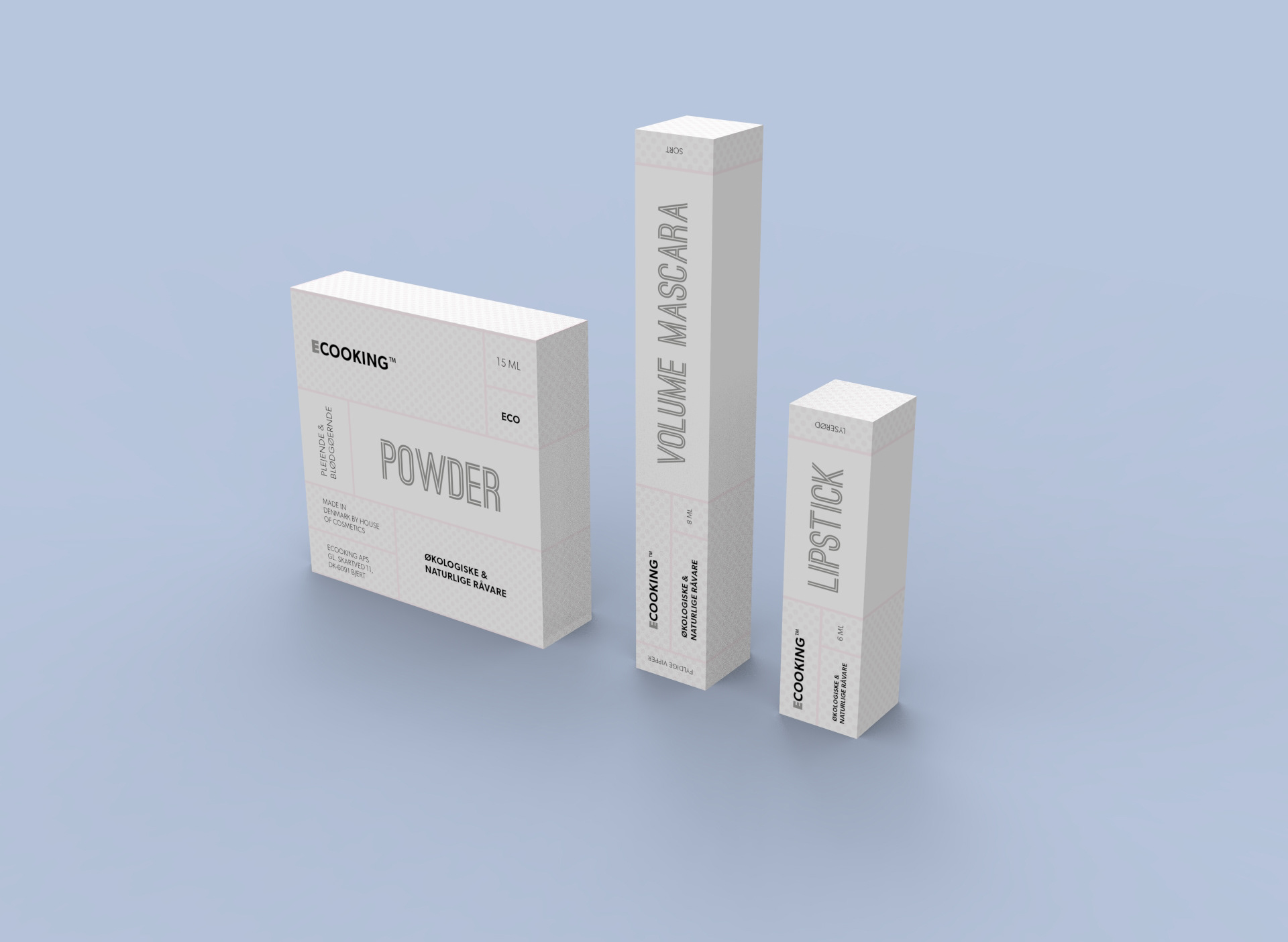
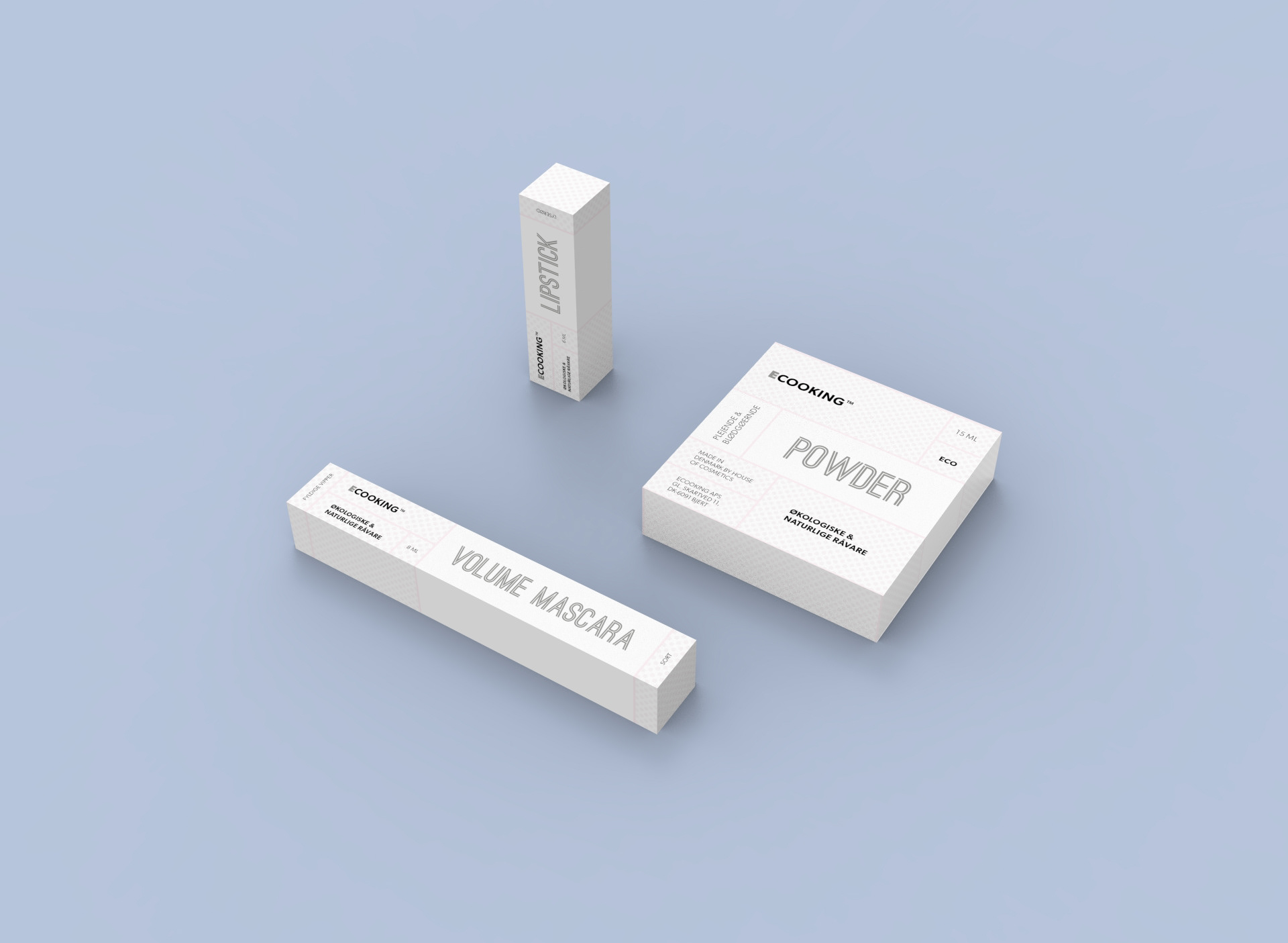
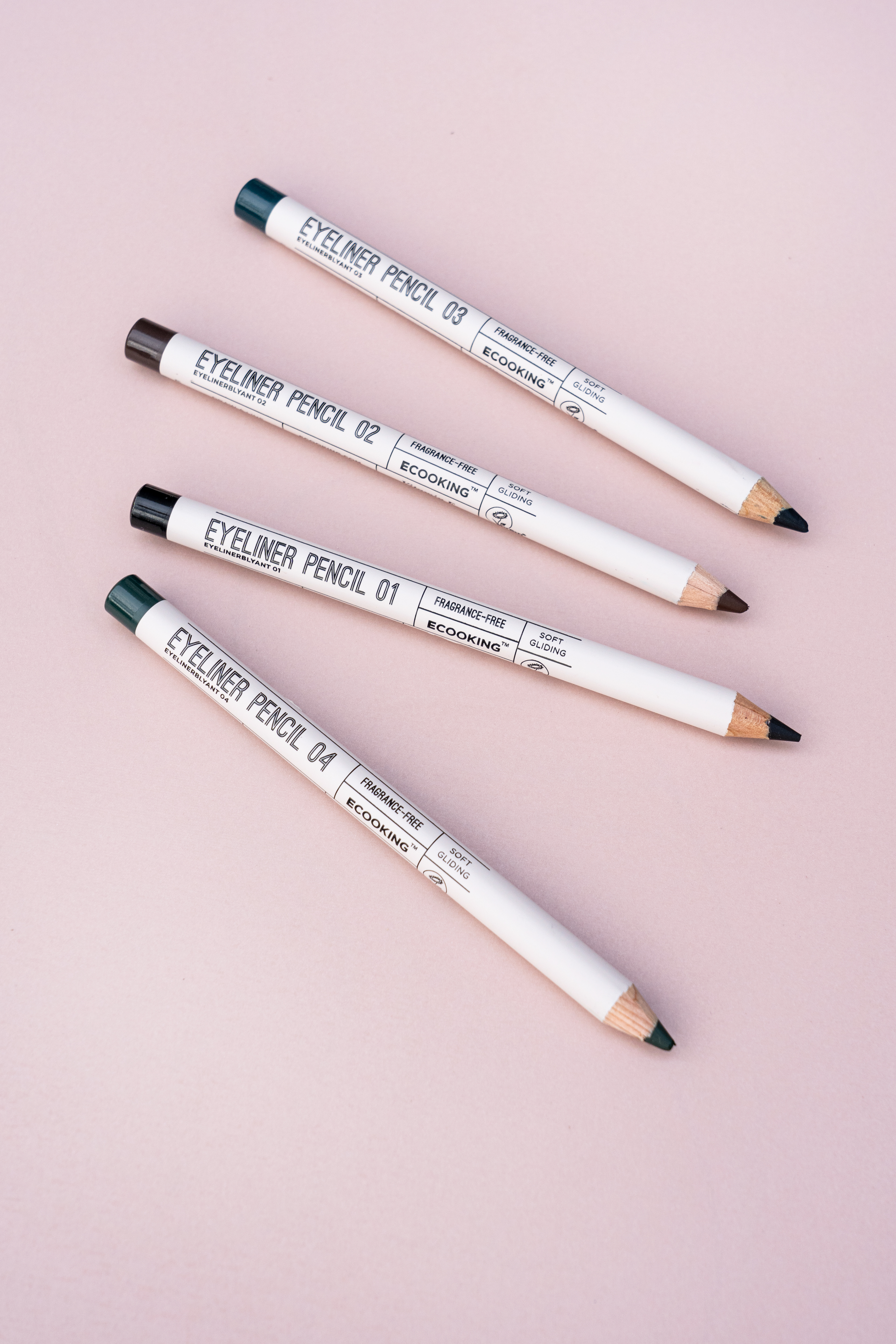
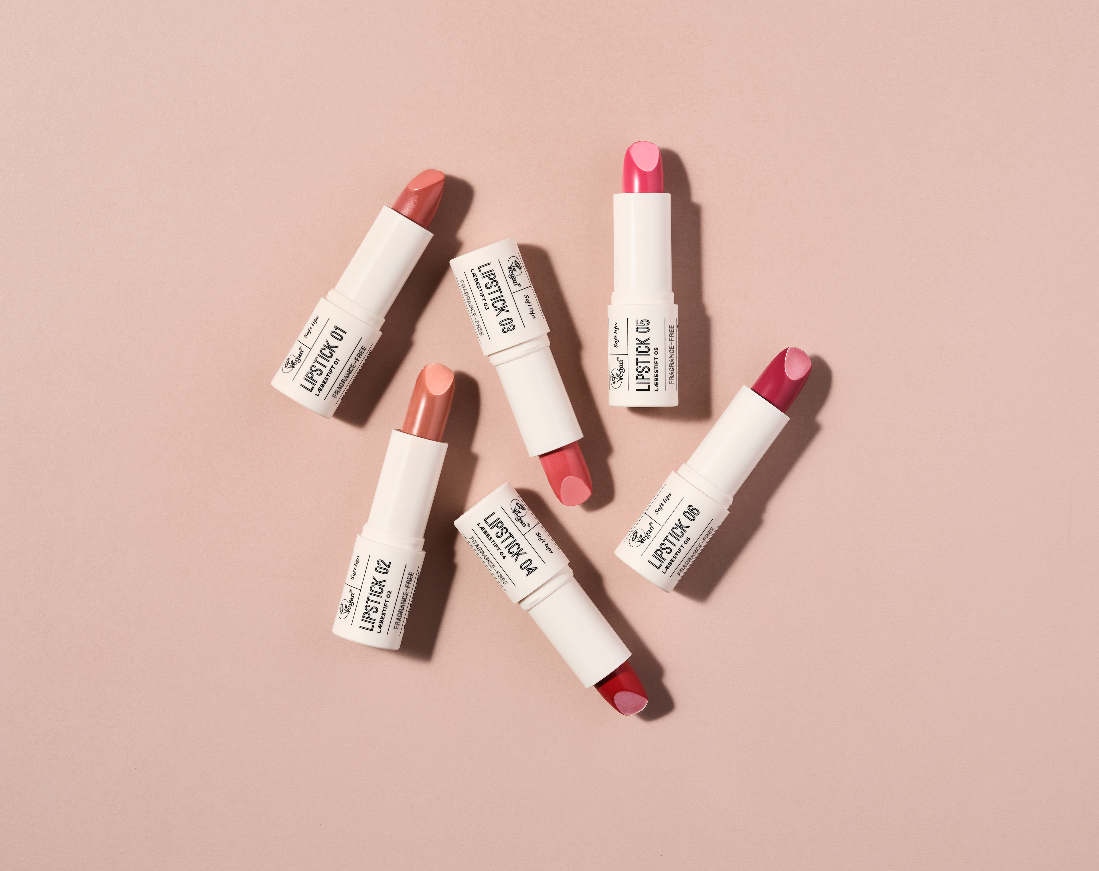
Here is the makeup line that I designed for Ecooking.
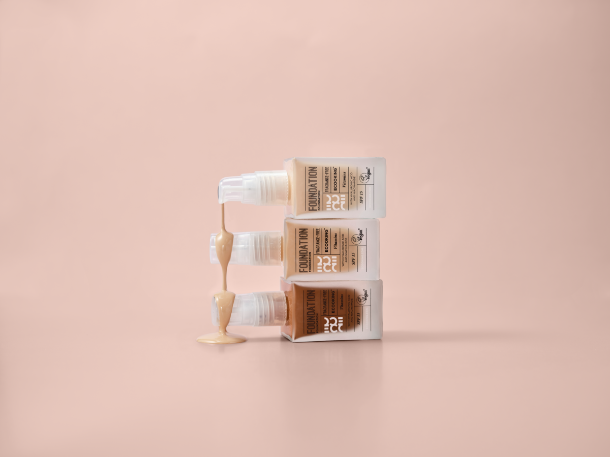
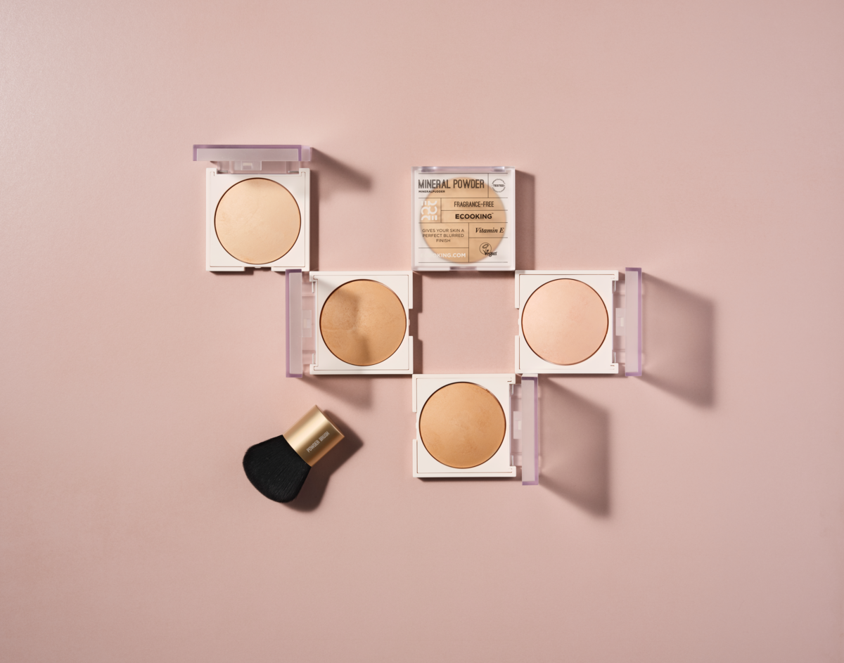
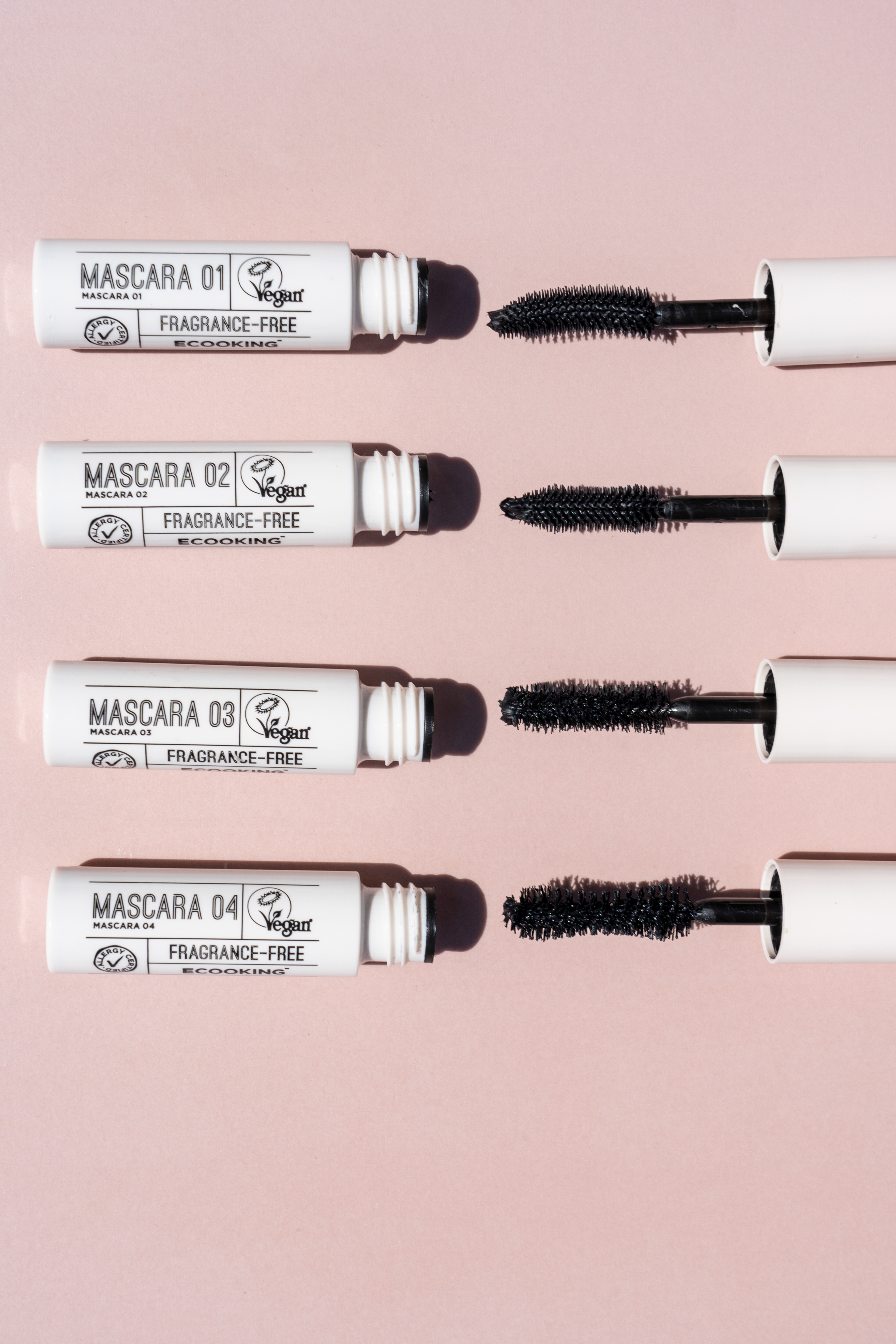
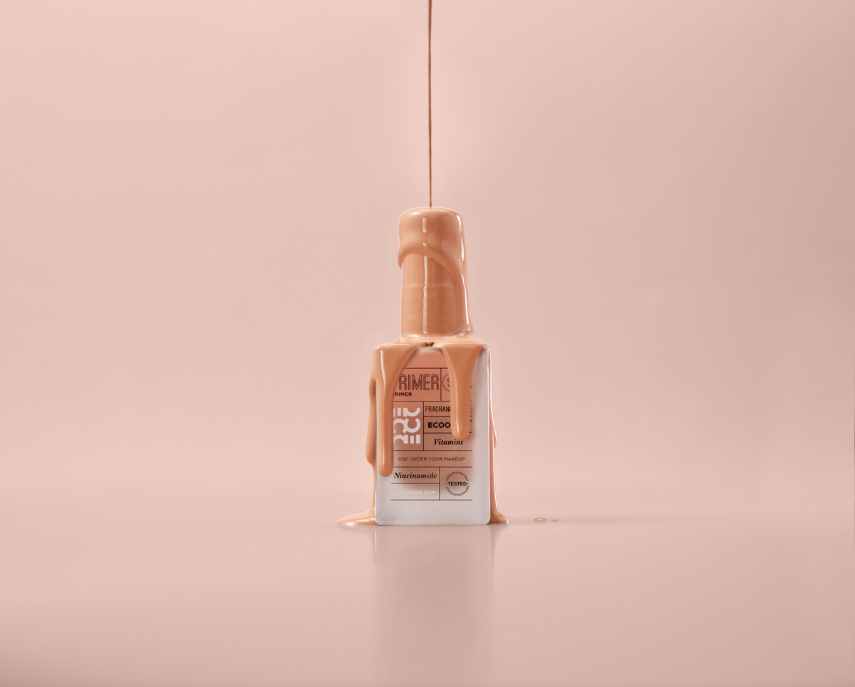
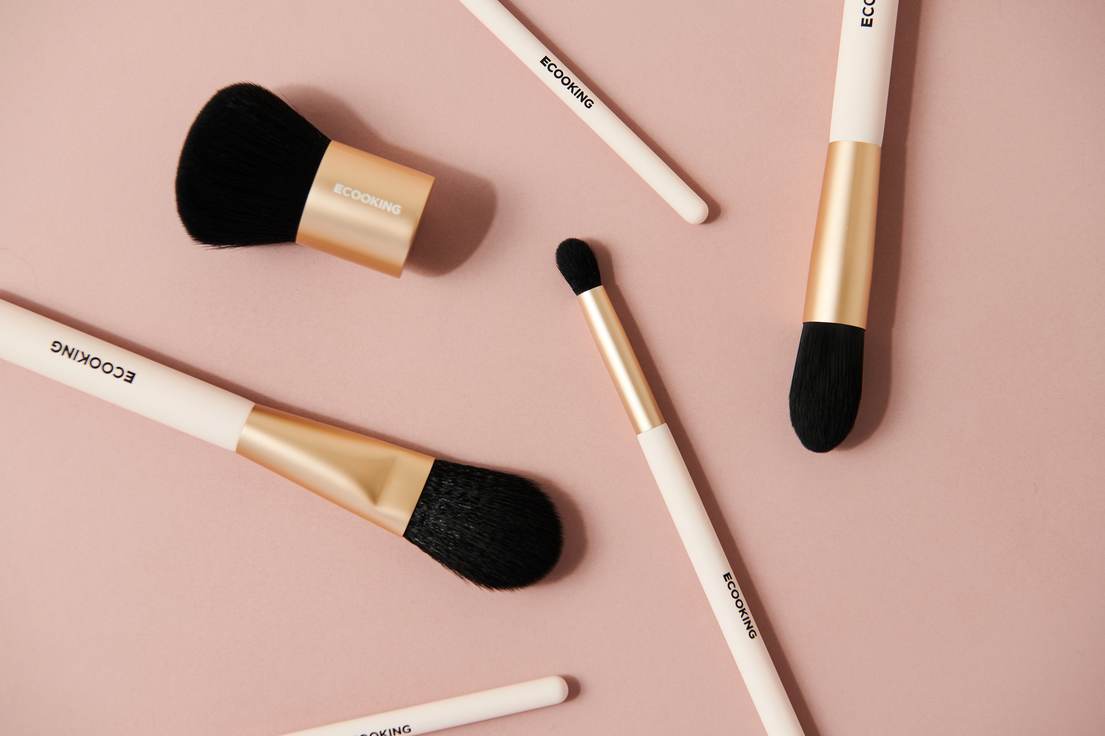
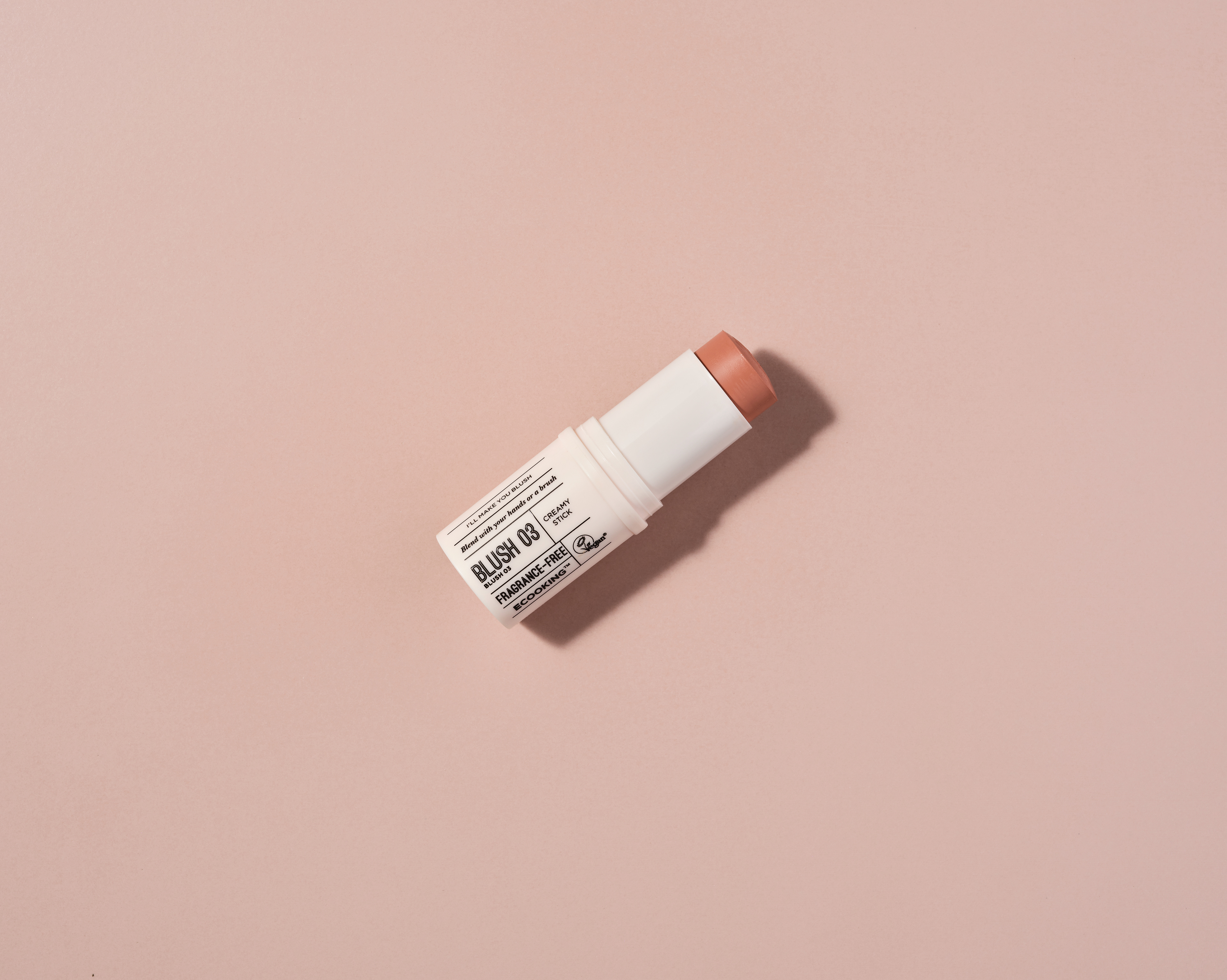
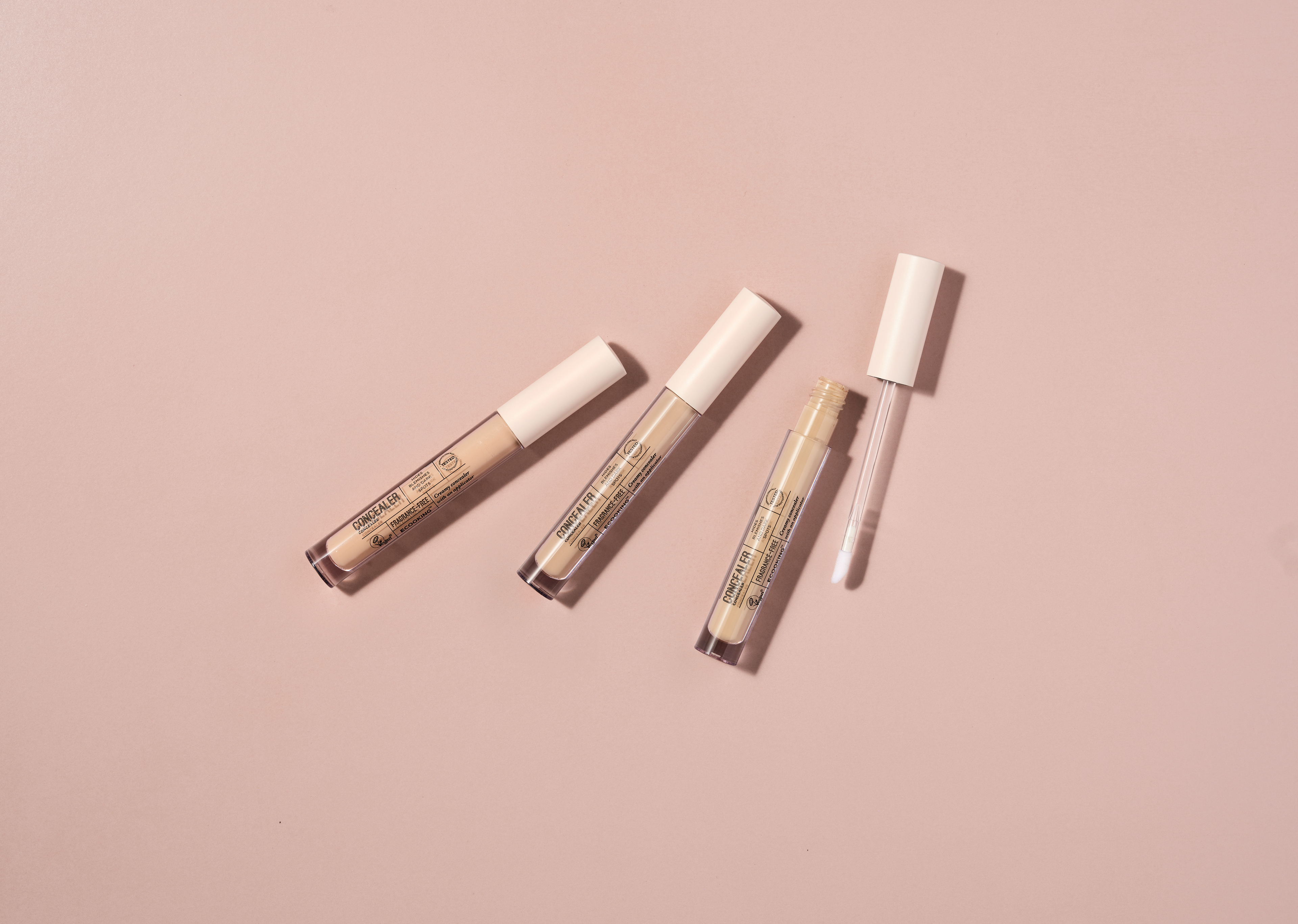
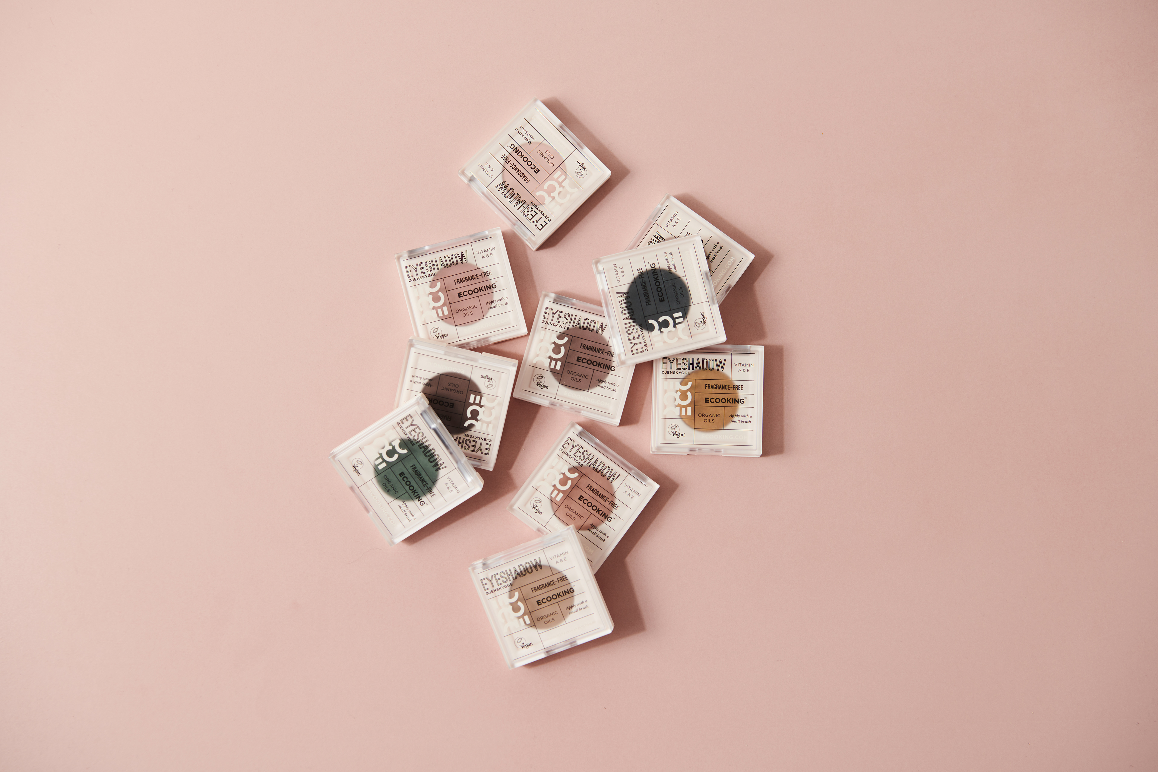
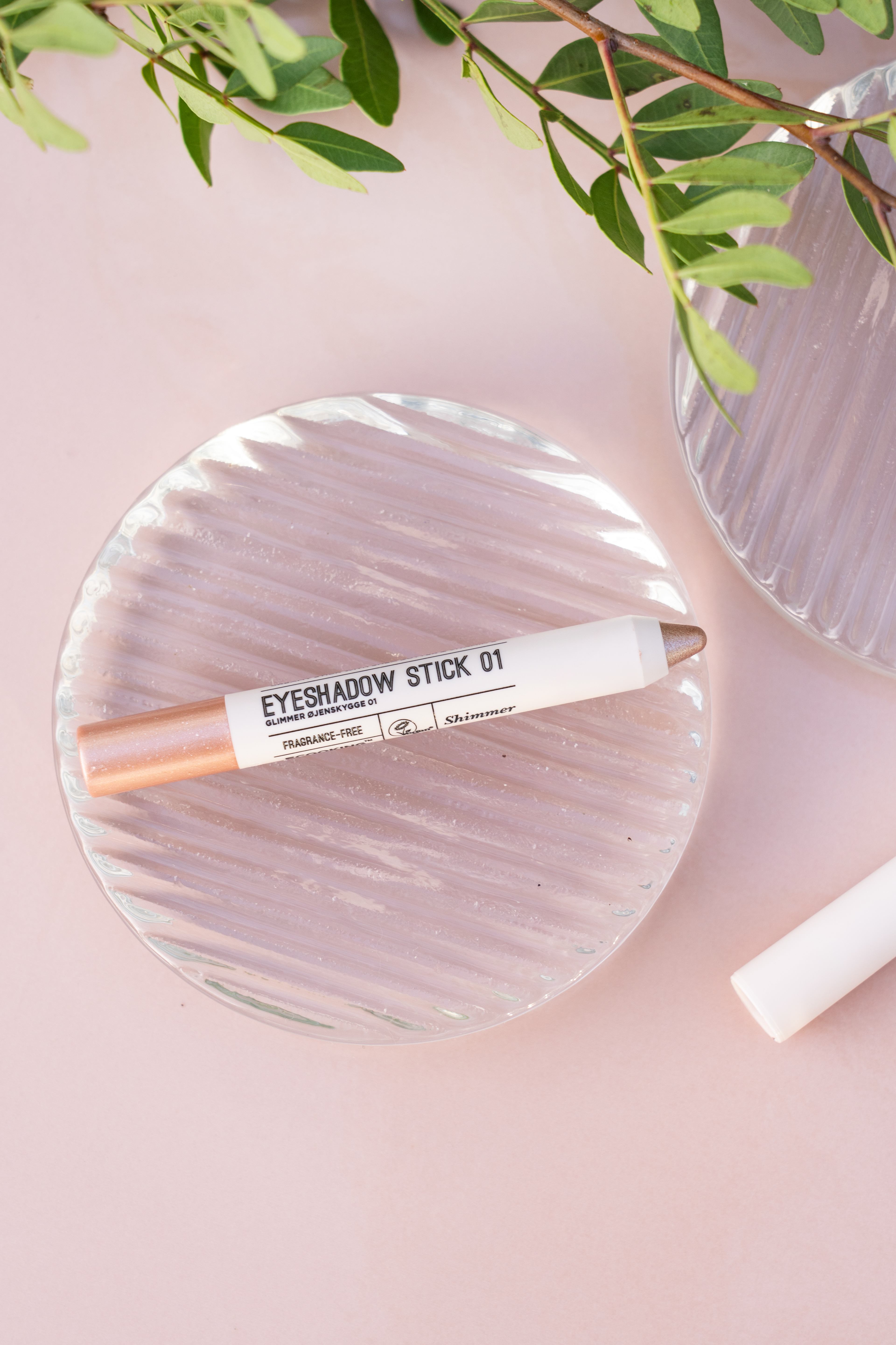
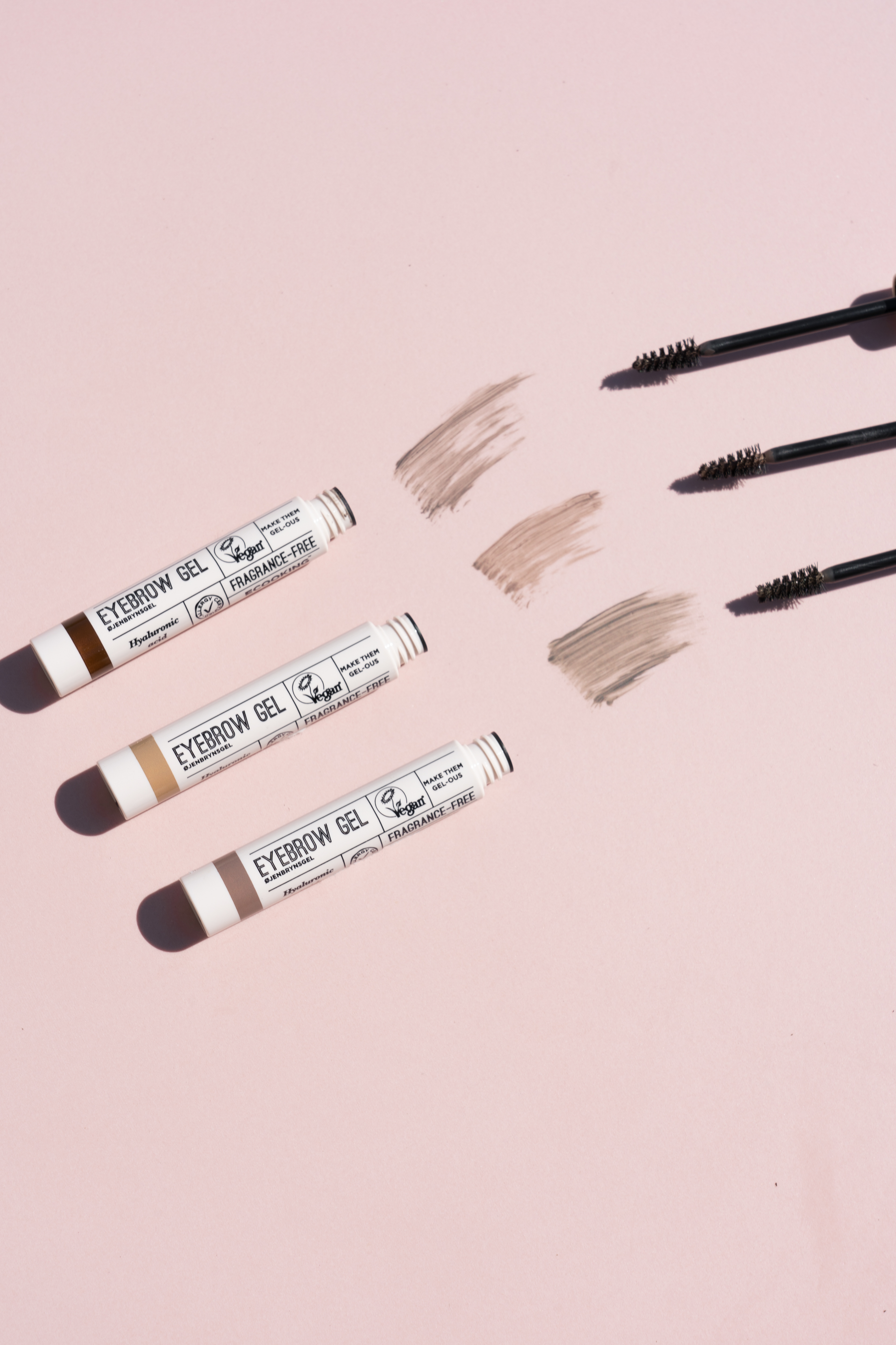
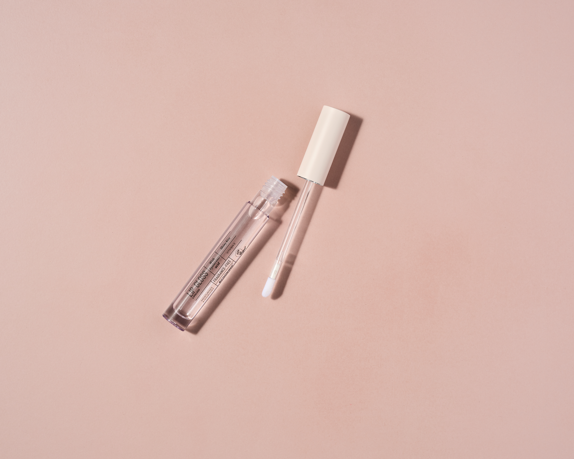
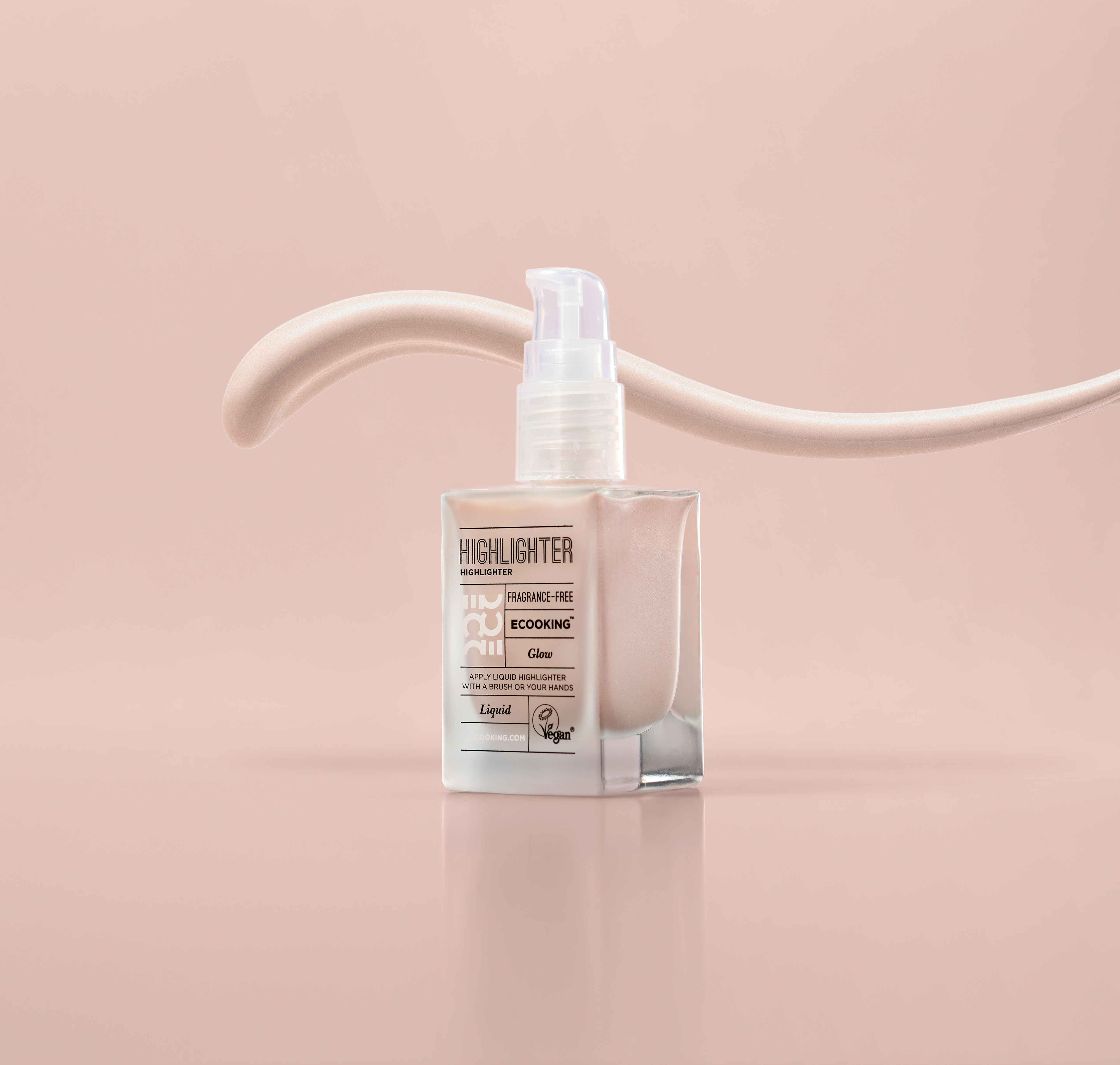
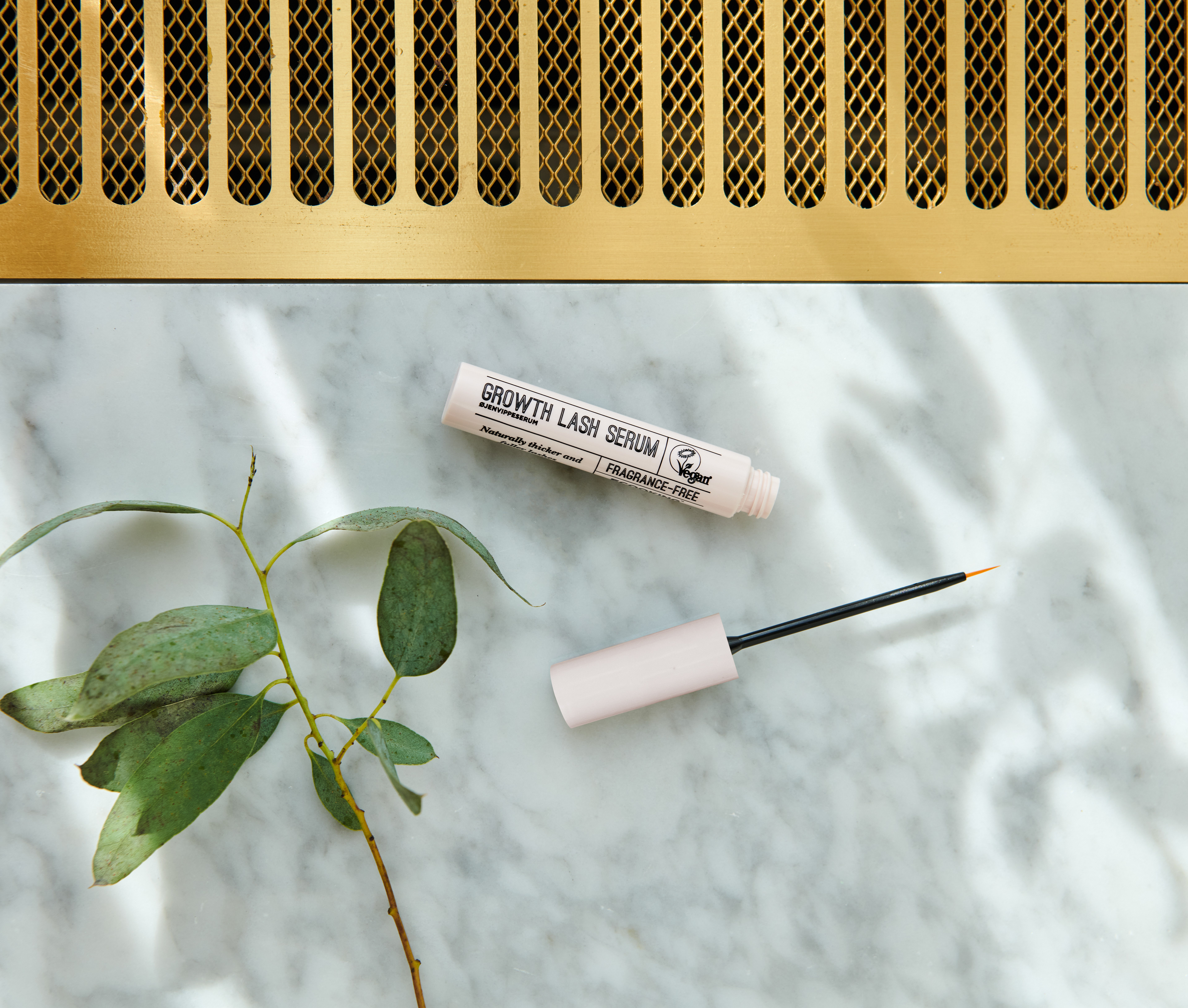
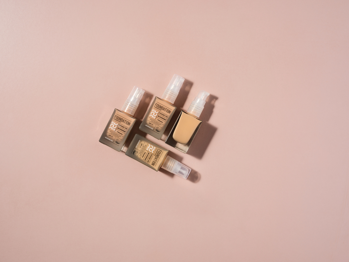
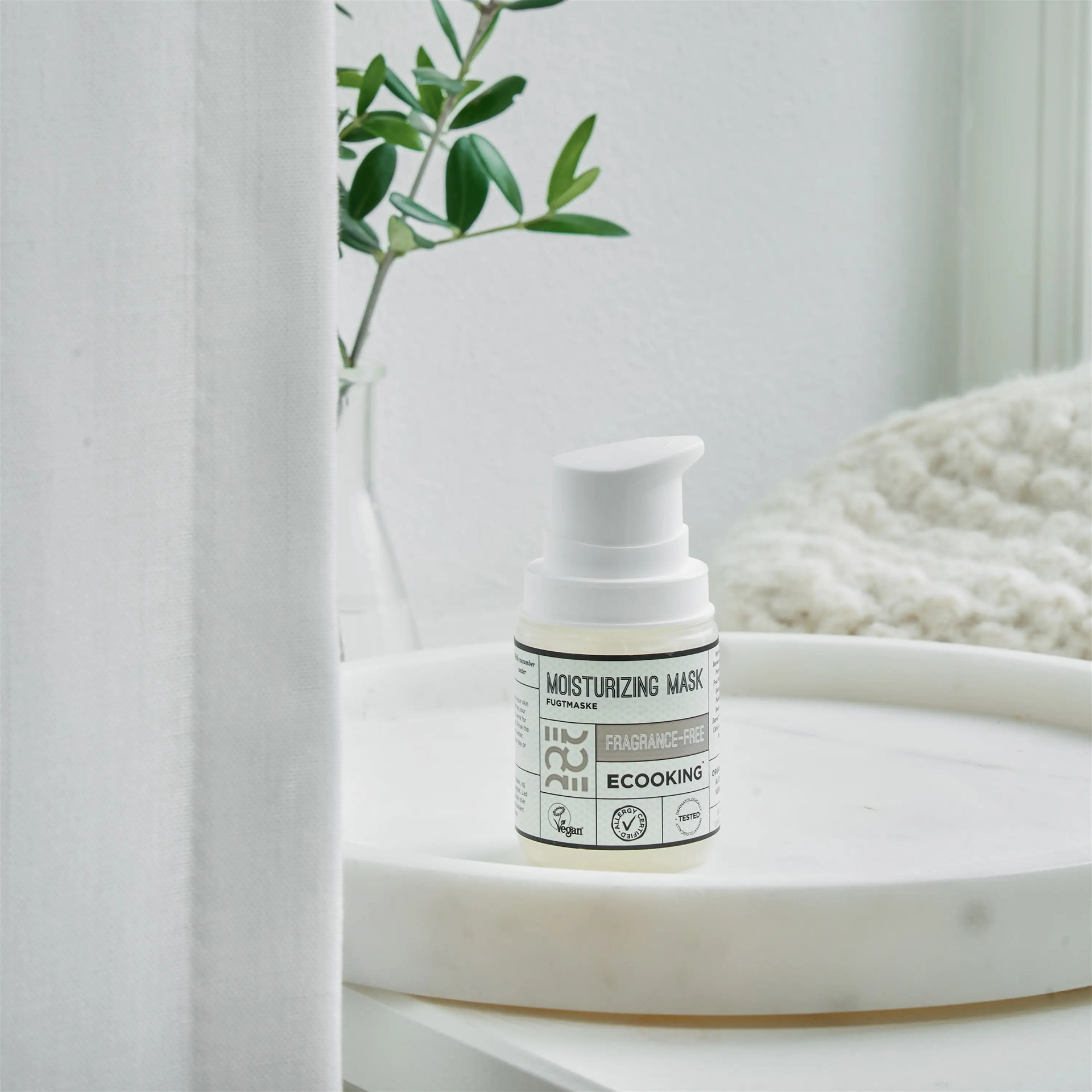
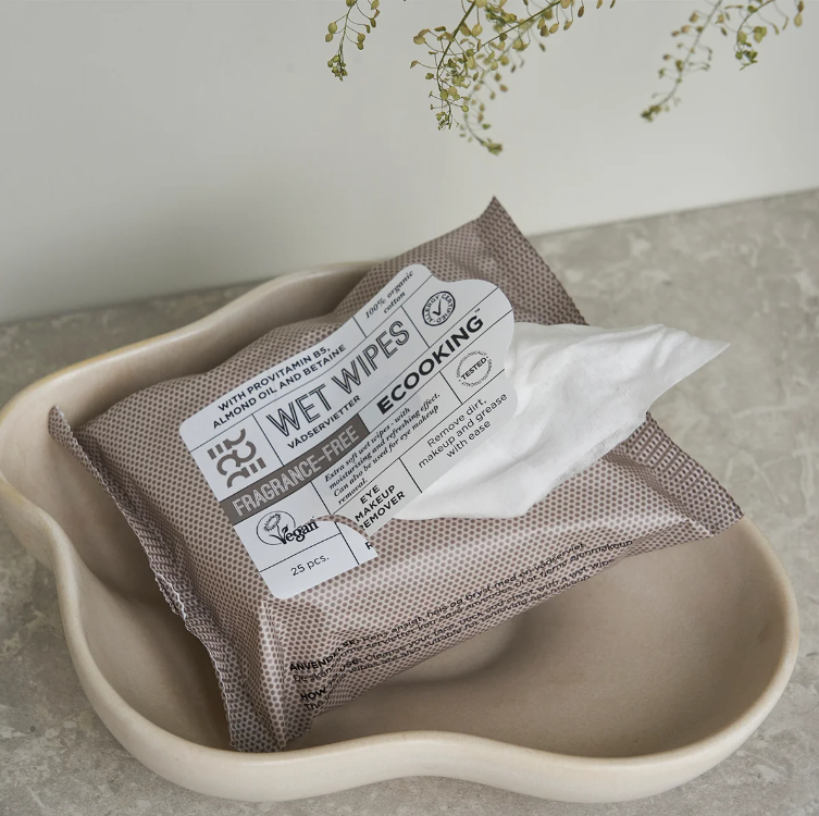
This is some examples of other products that I have designed for the face and hands.
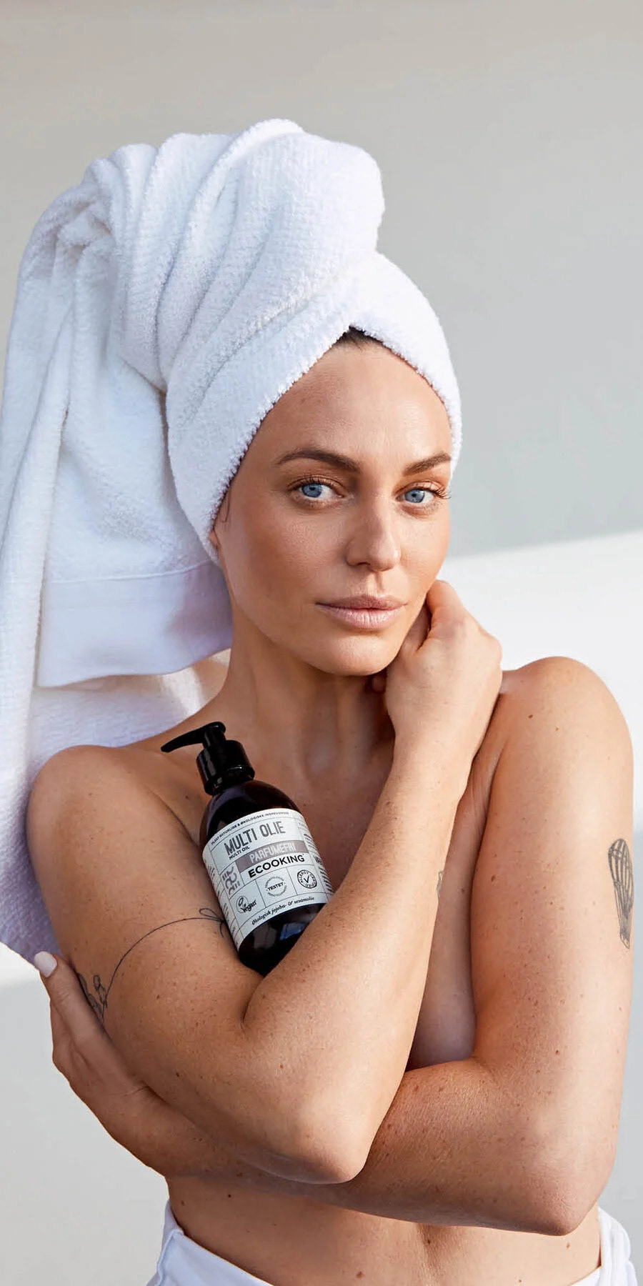
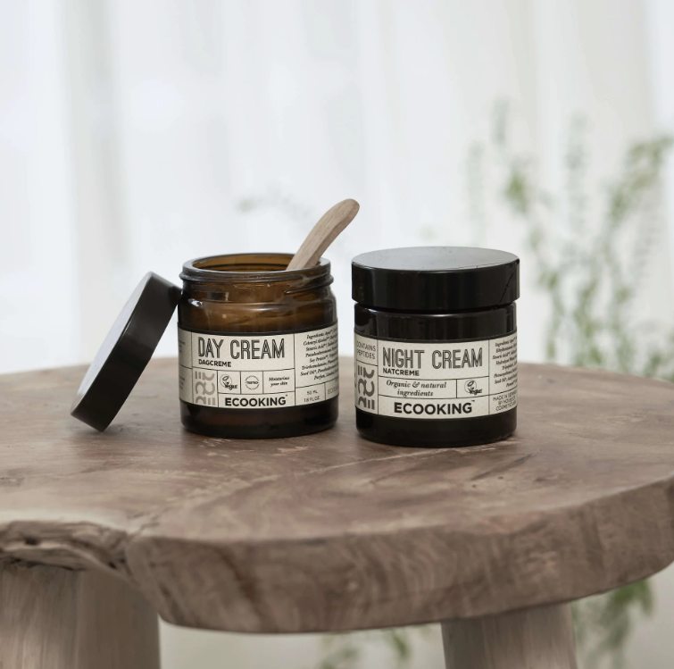
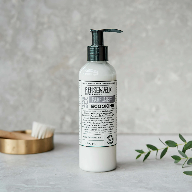
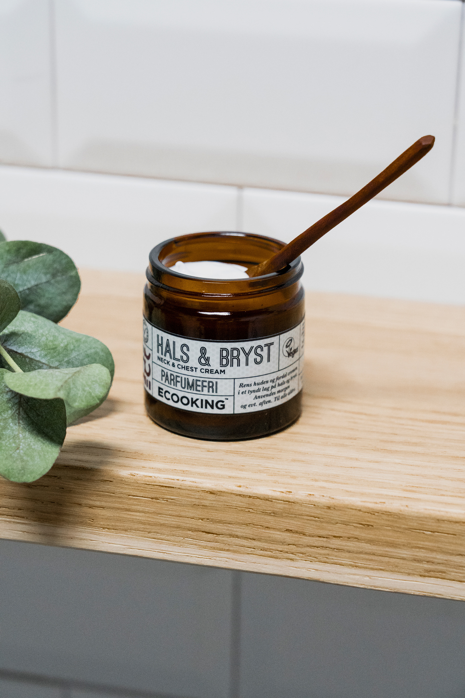
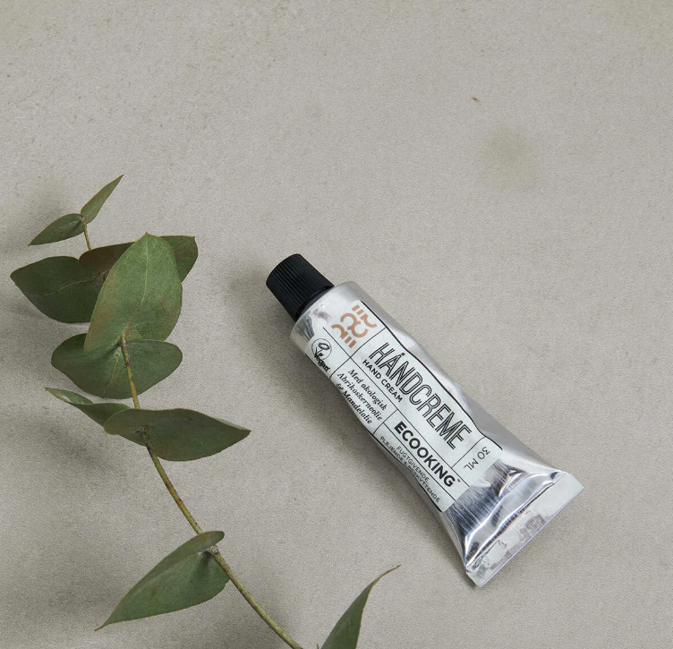
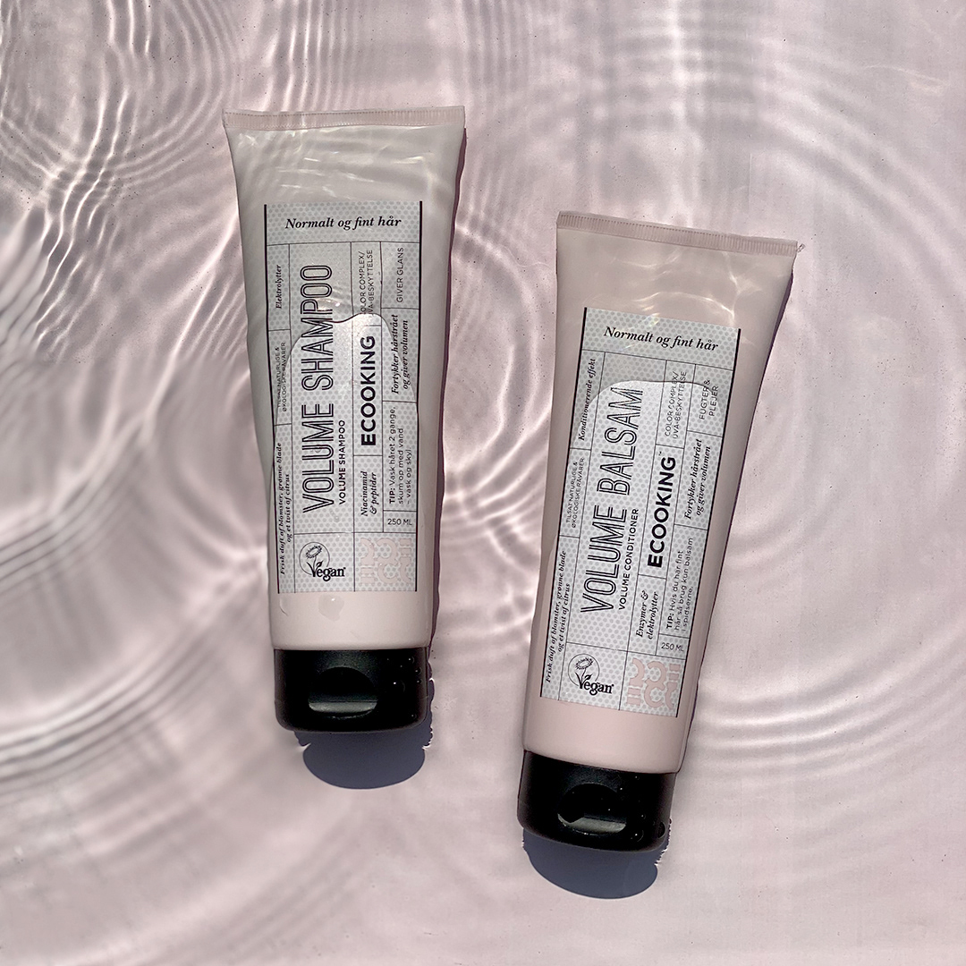
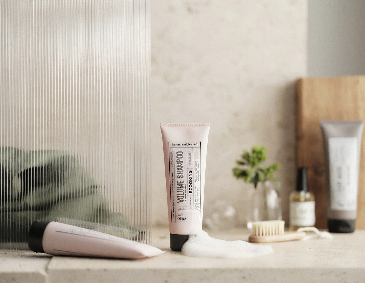
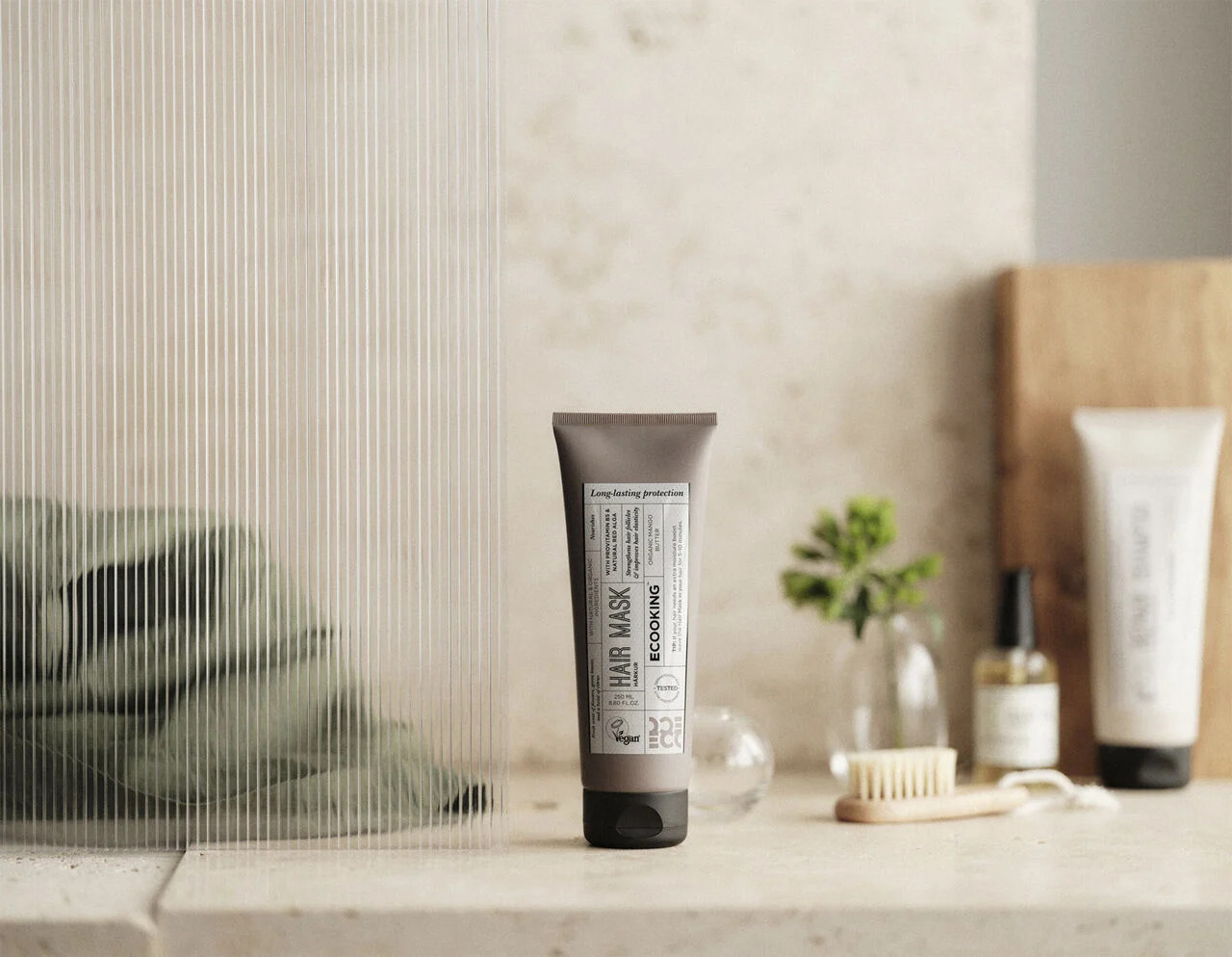
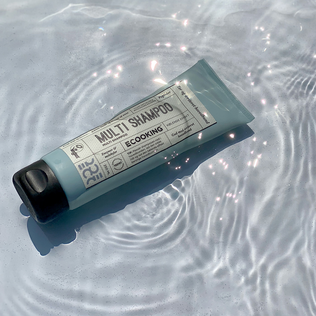
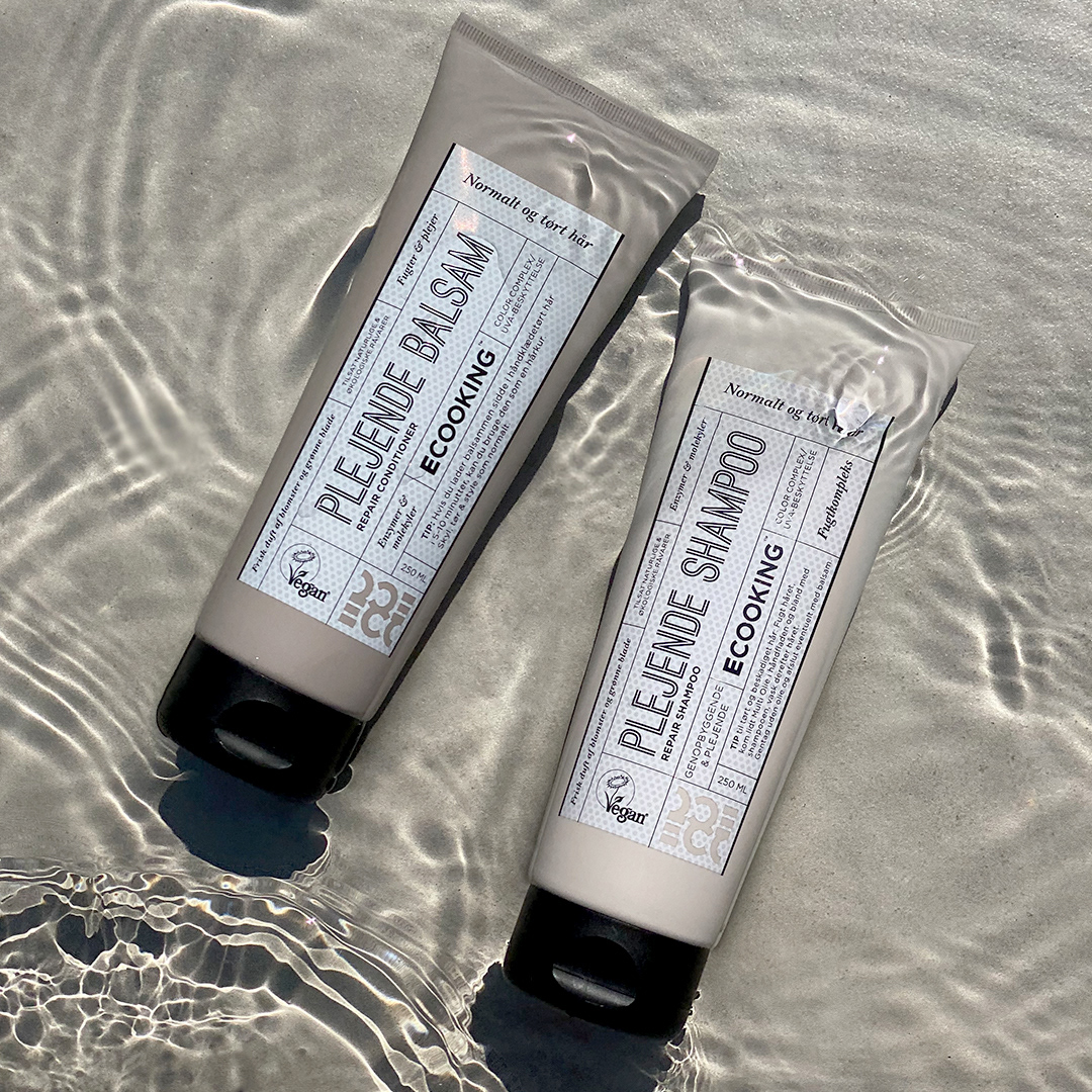
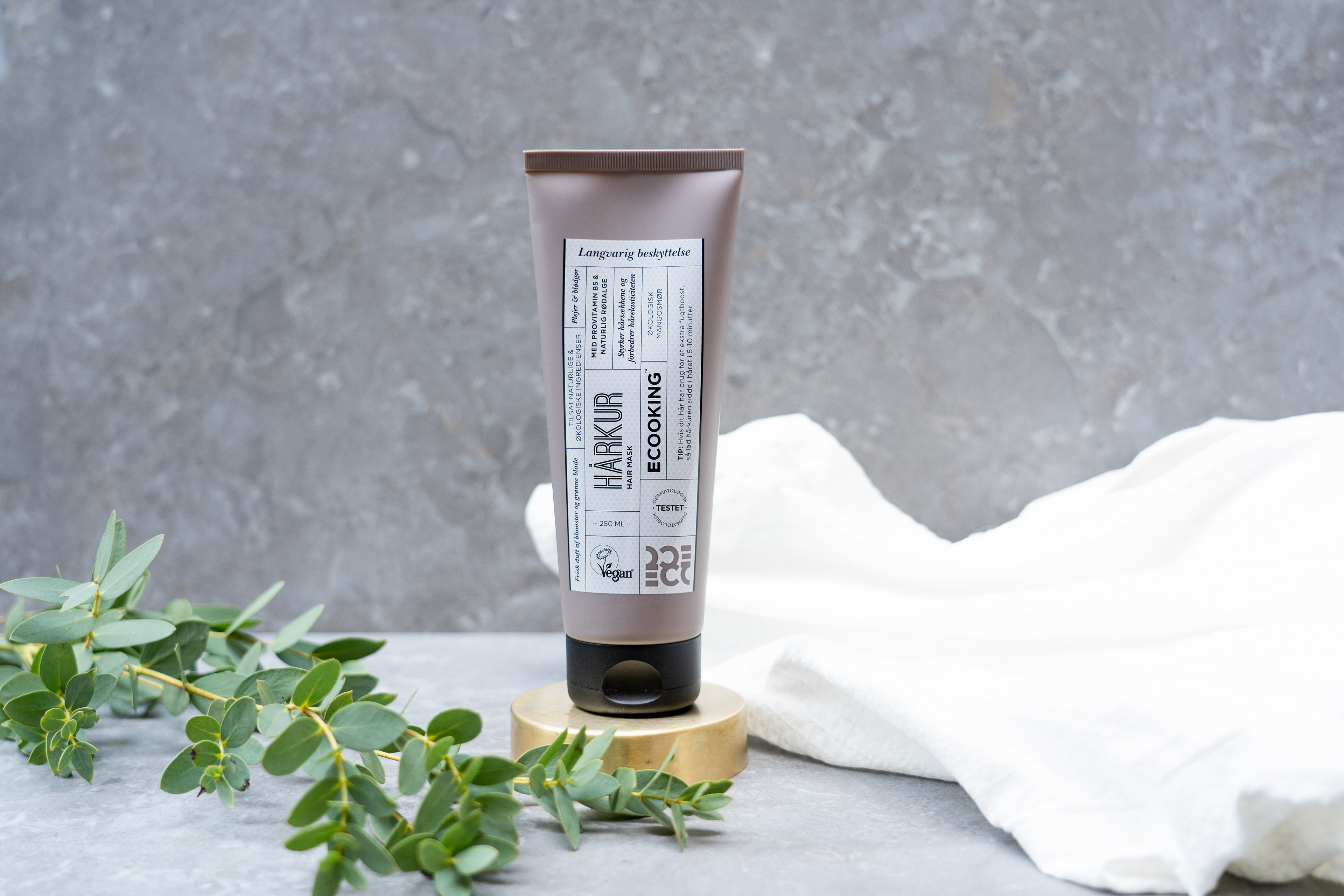
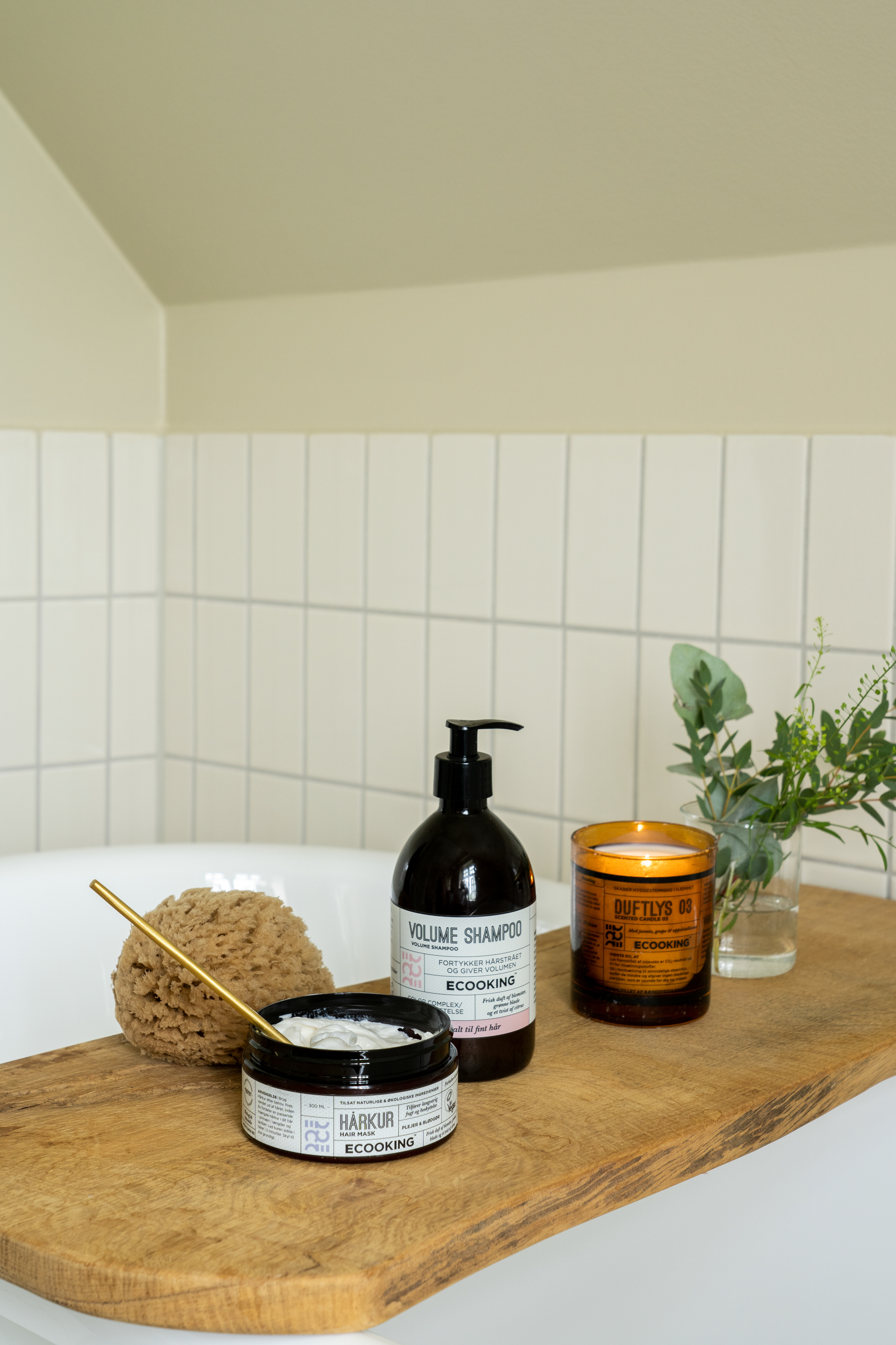
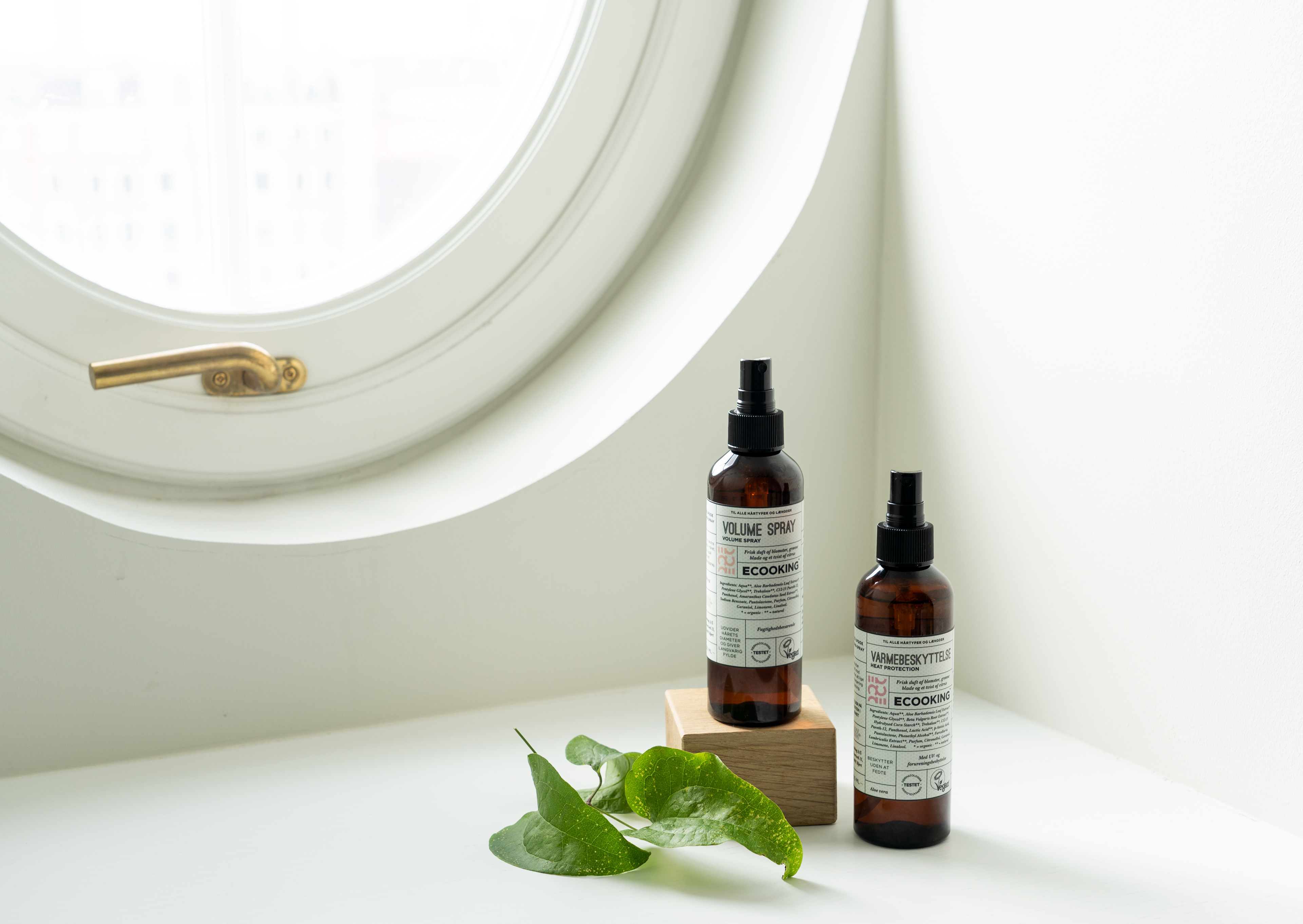
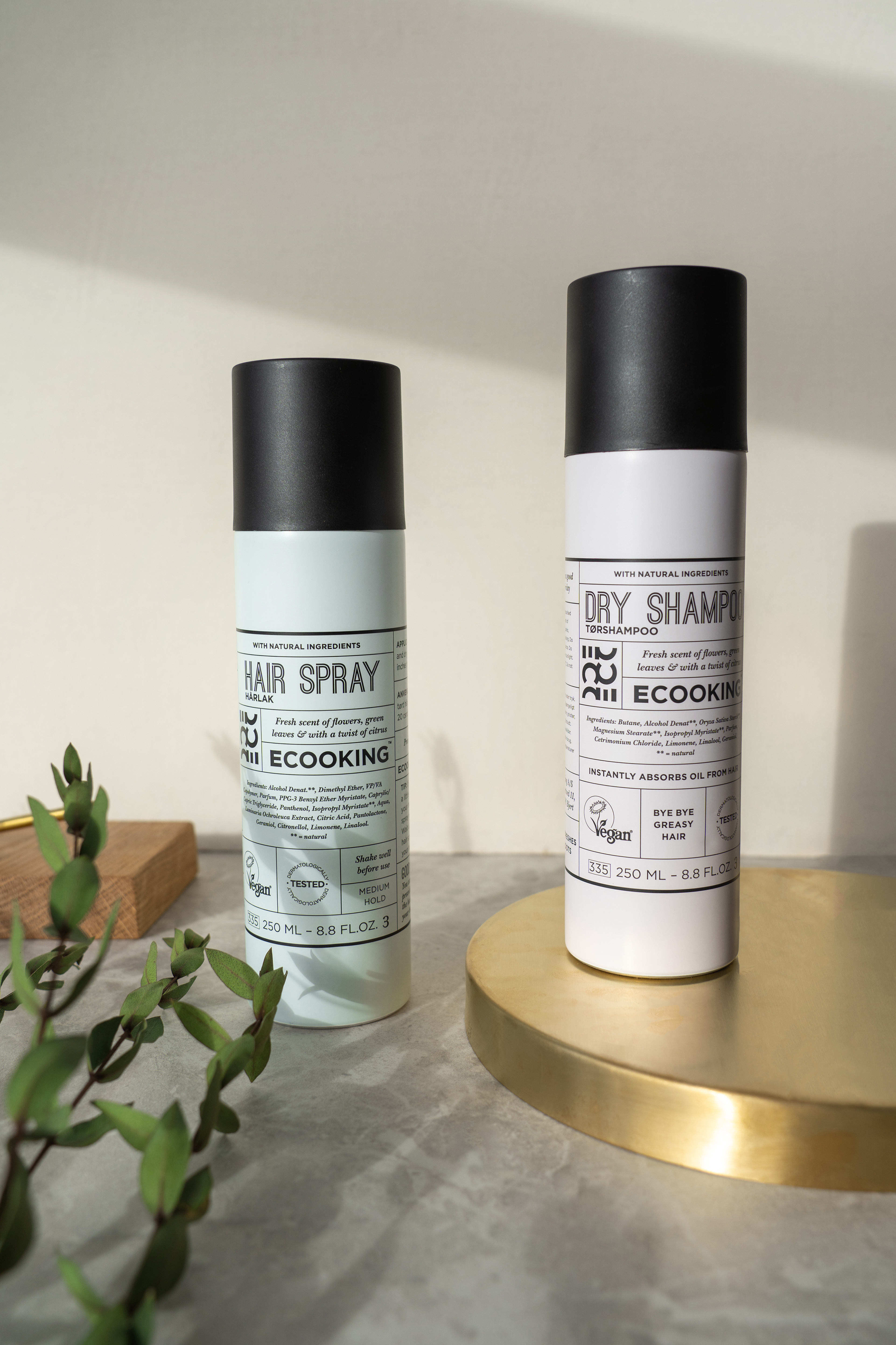
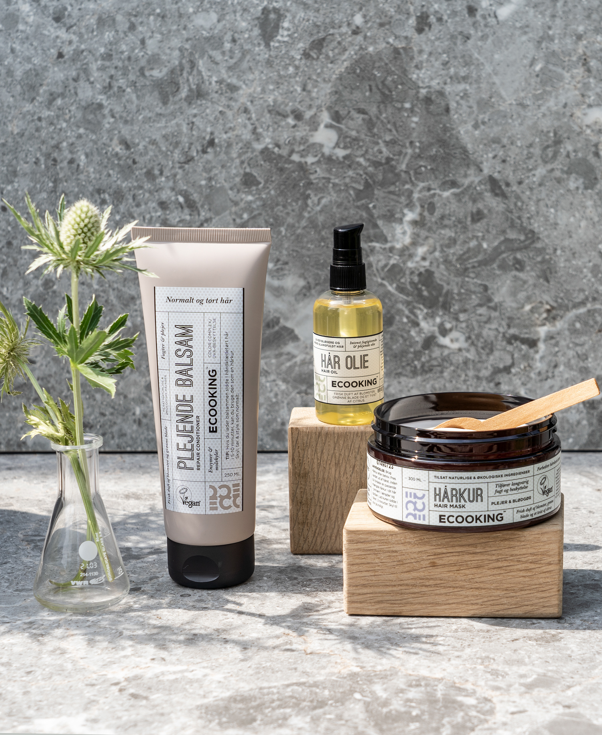
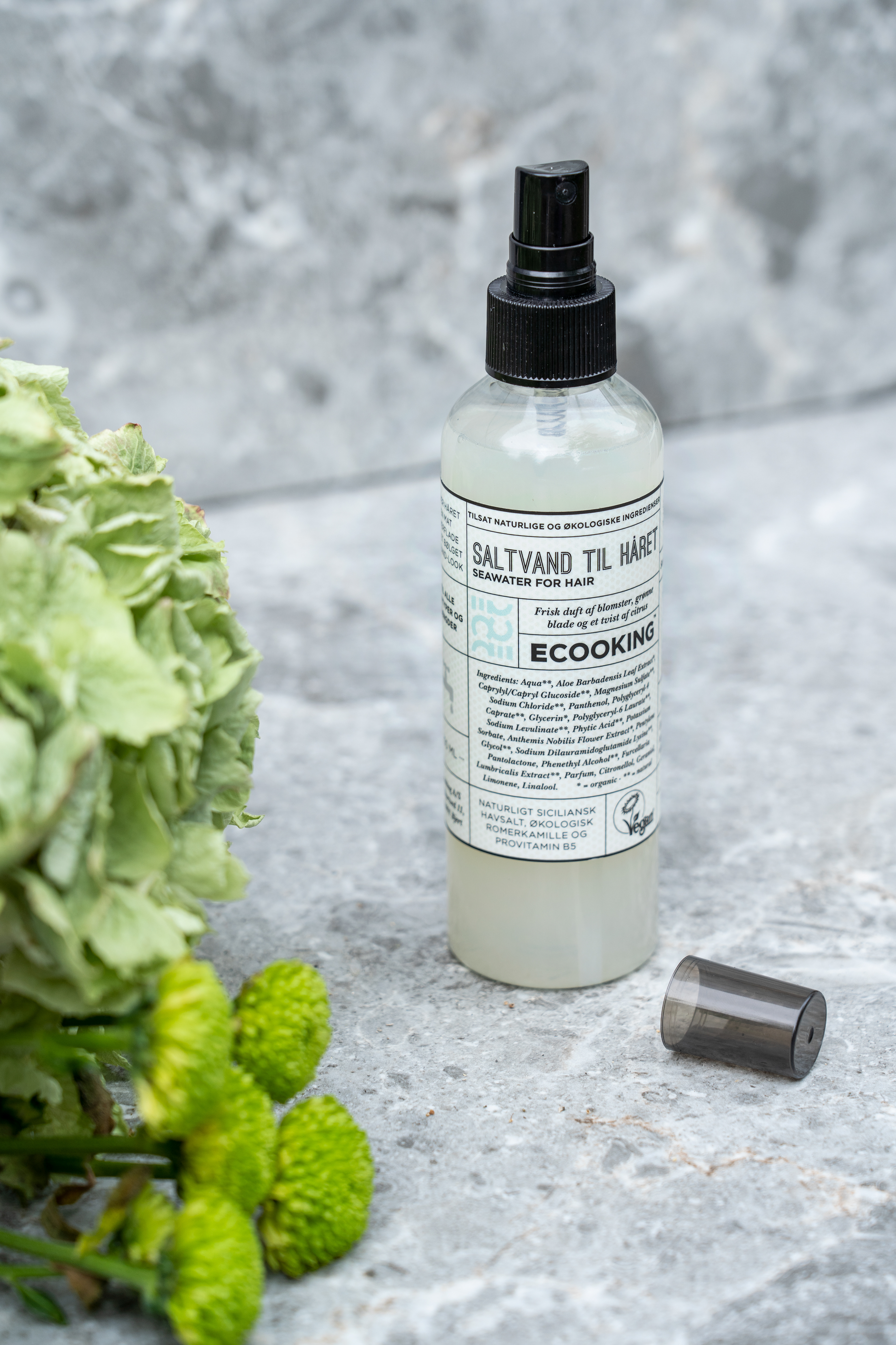
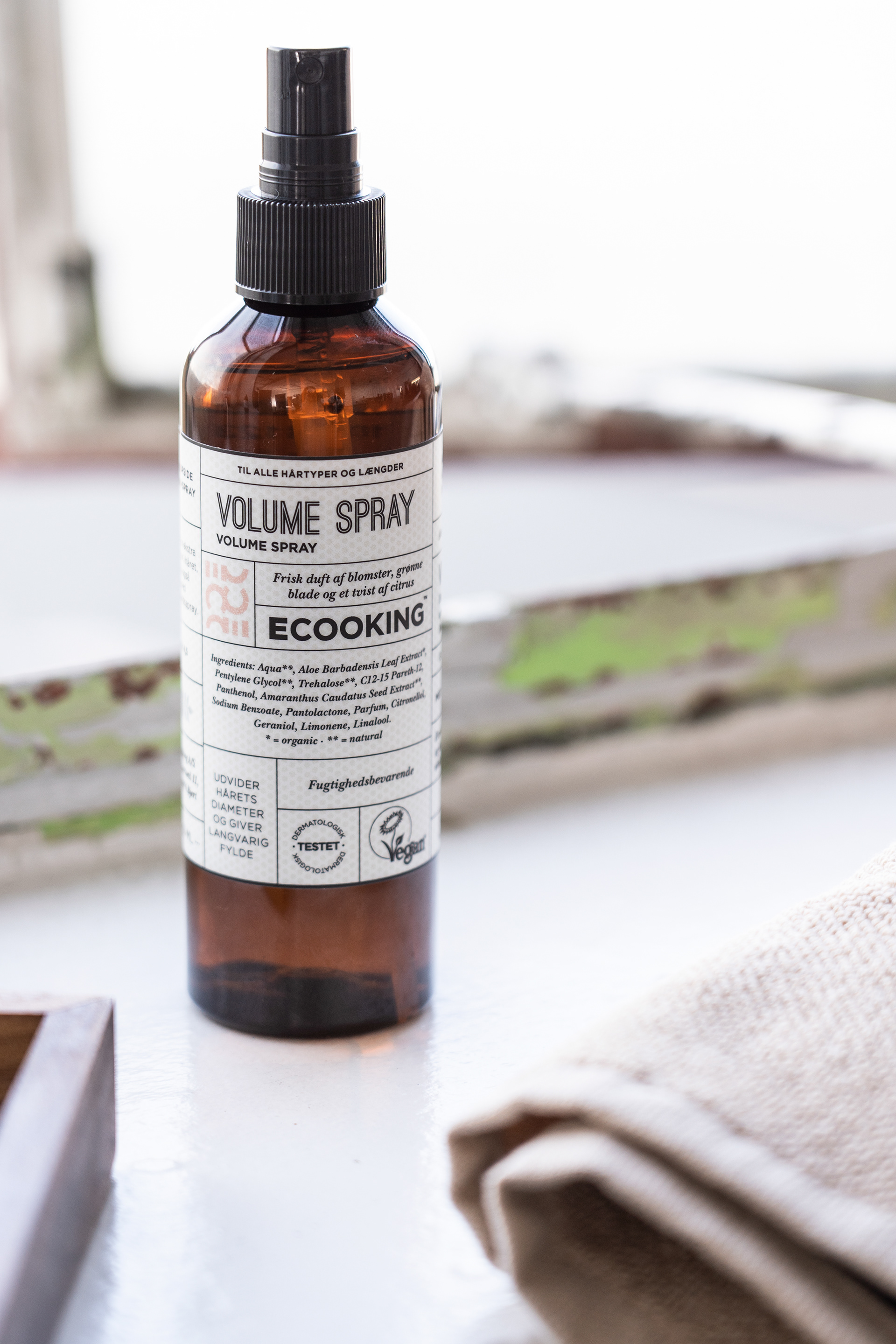
Hair products
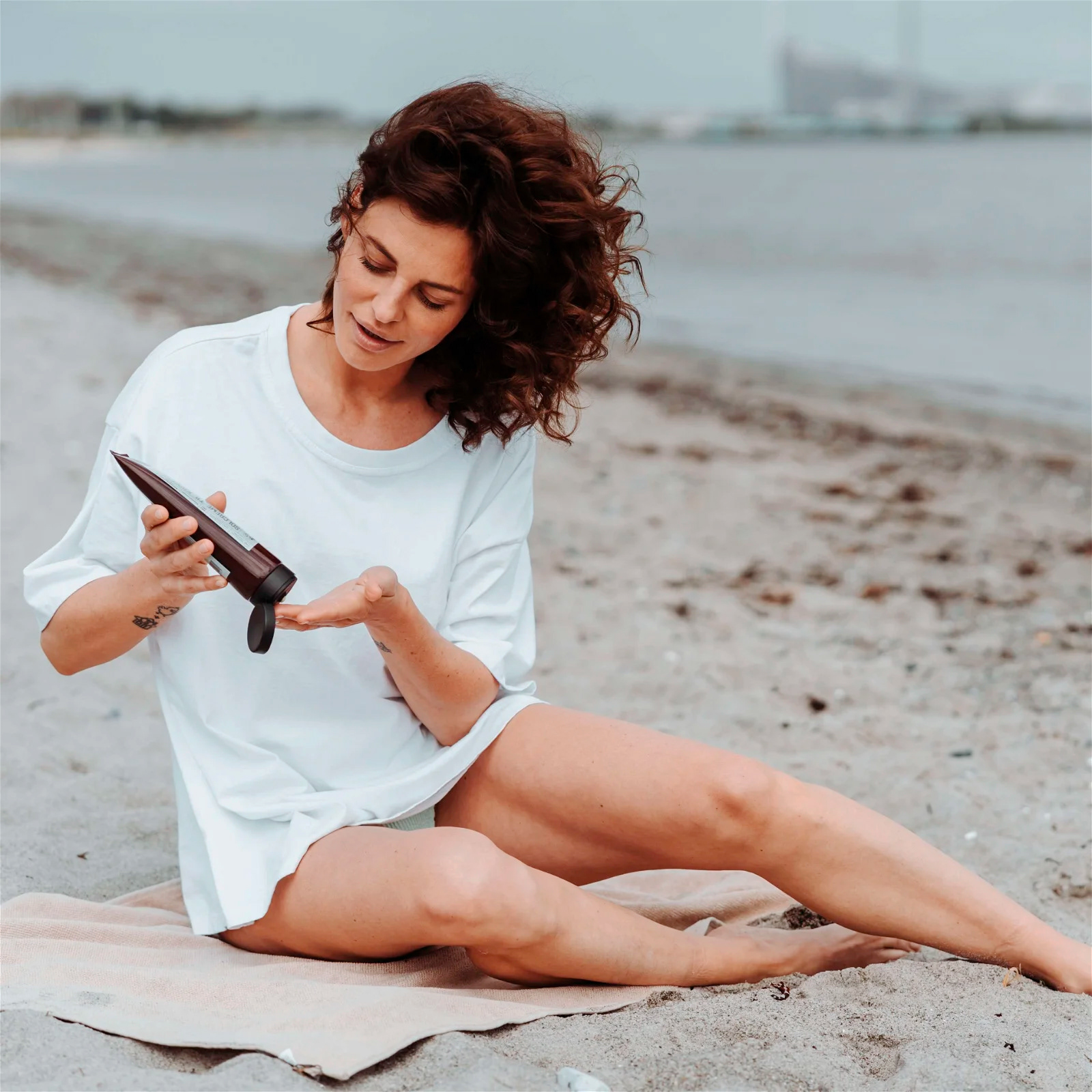
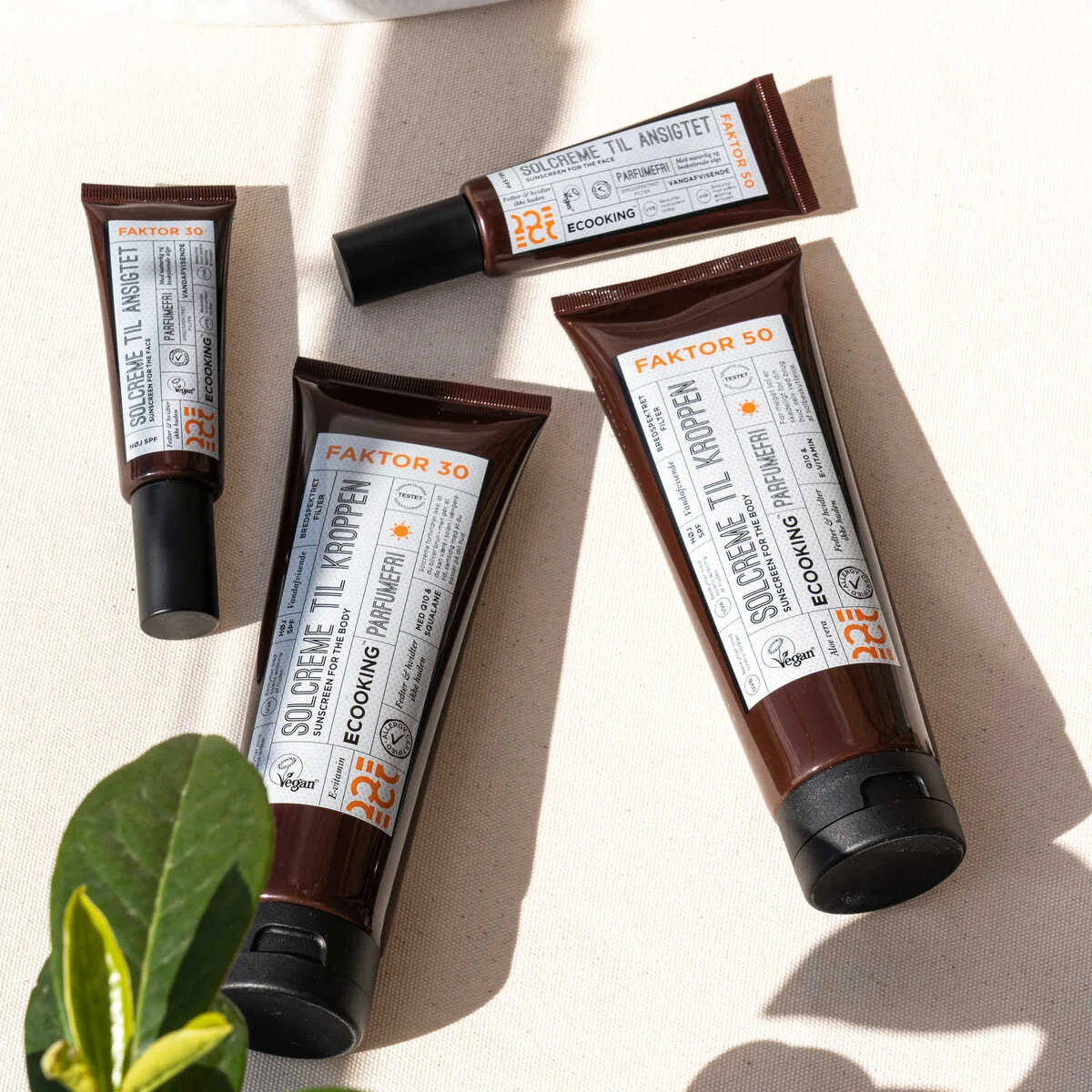
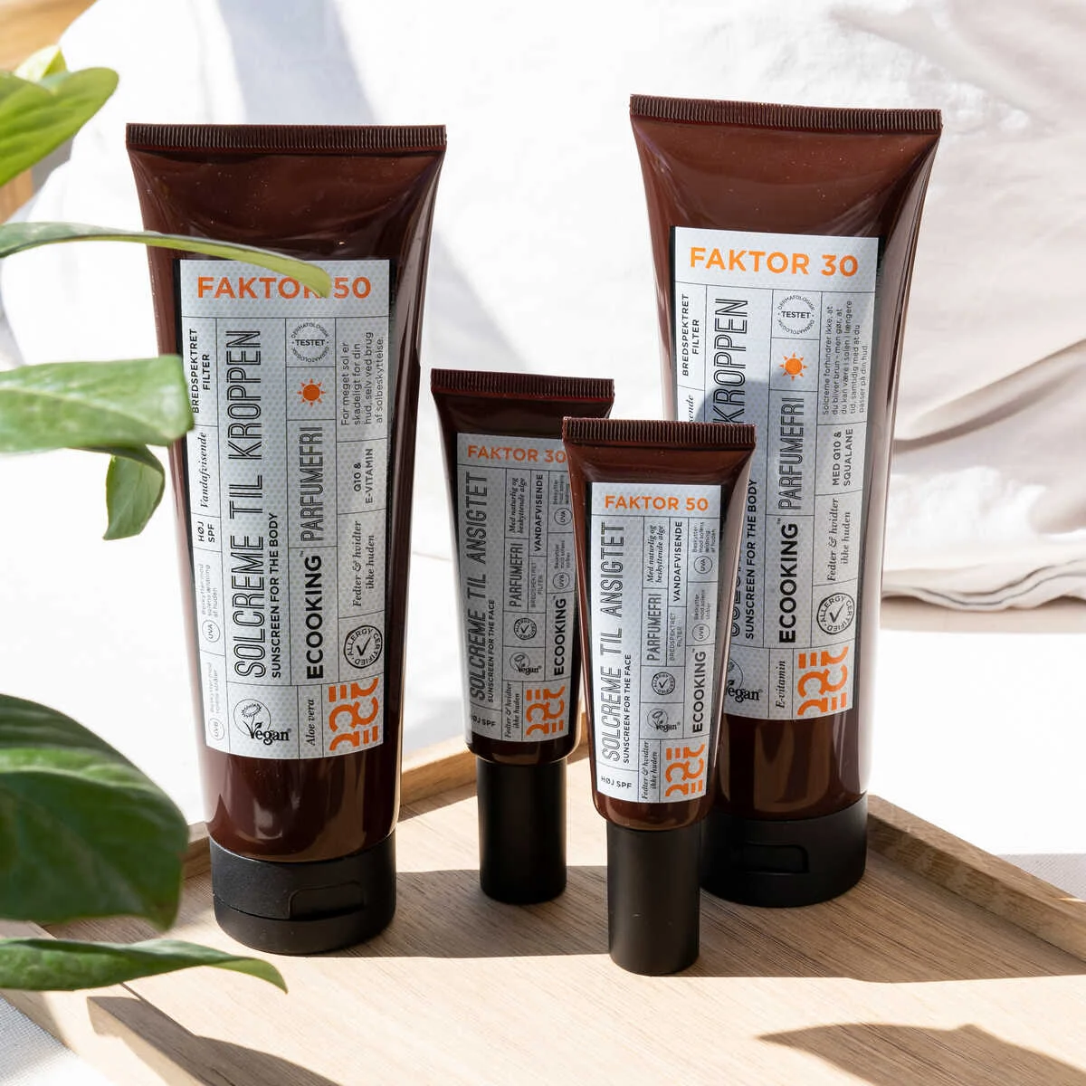
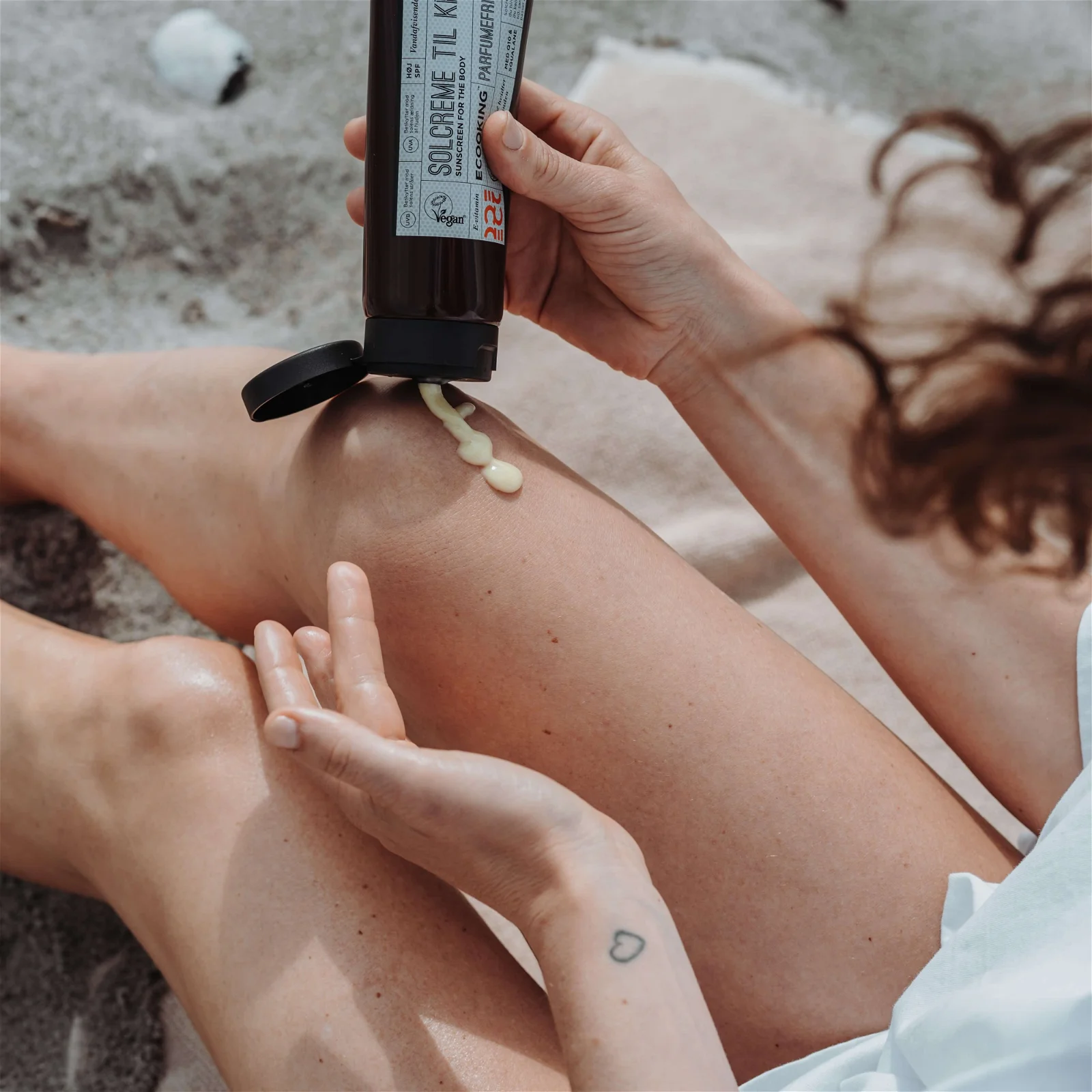
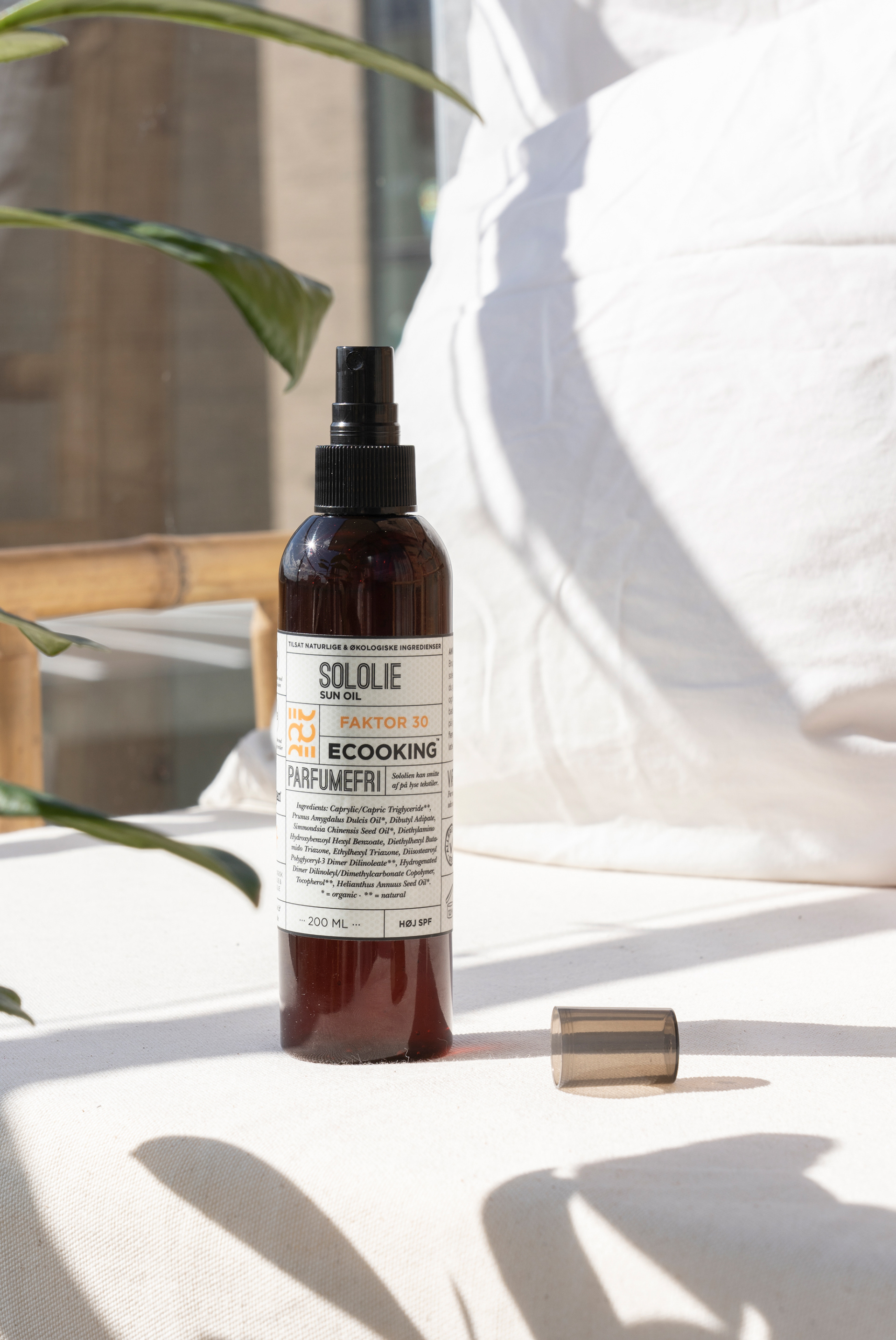
This is the SPF series of sunscreen that i designed
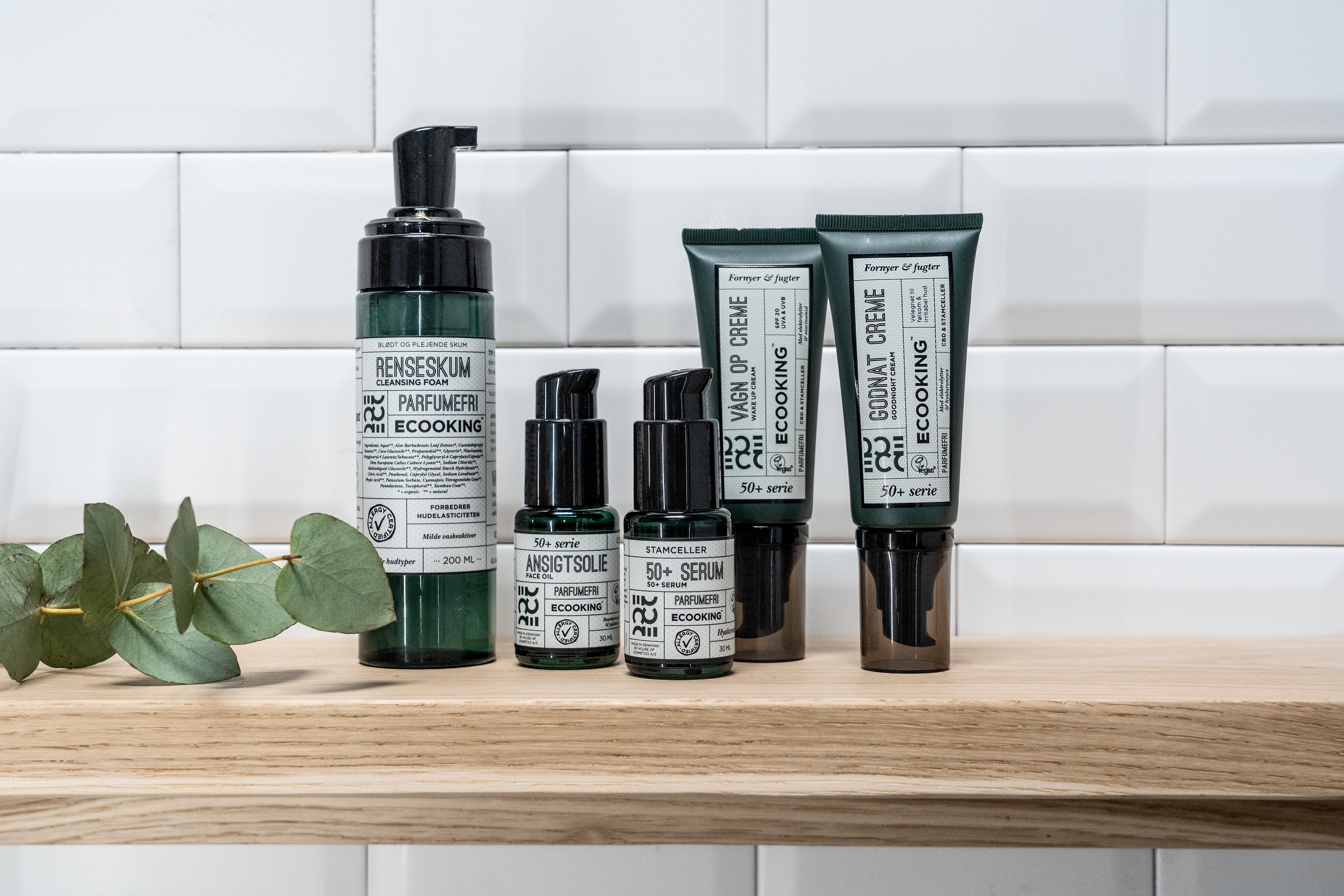
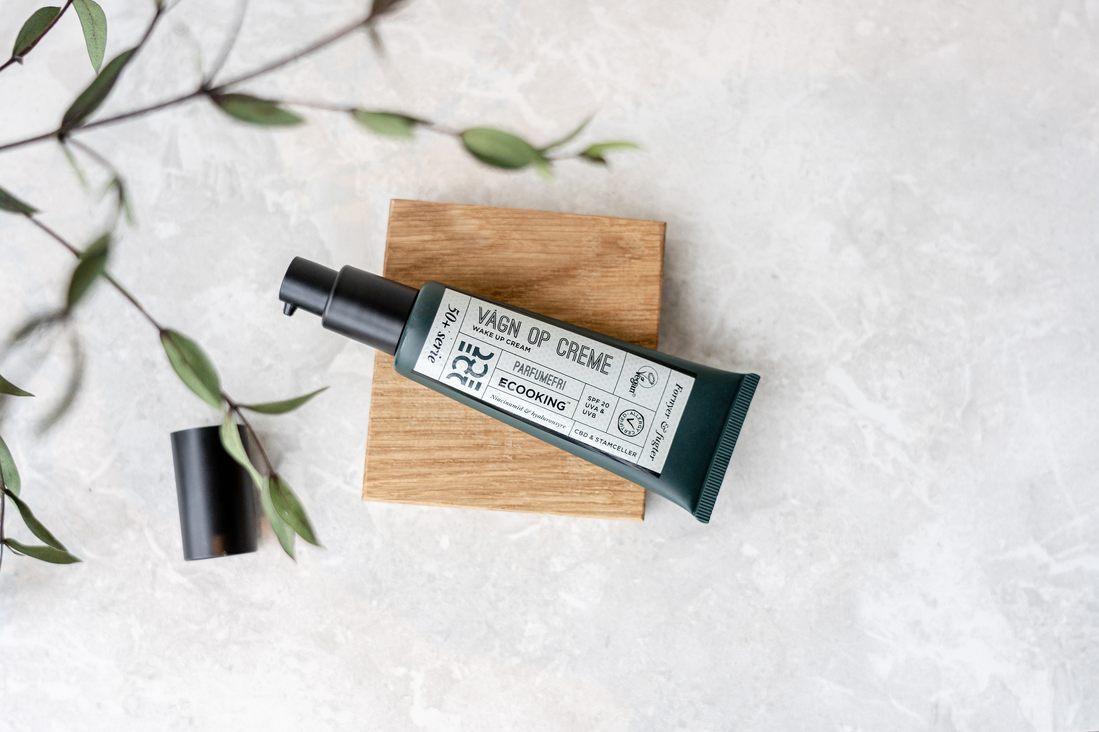
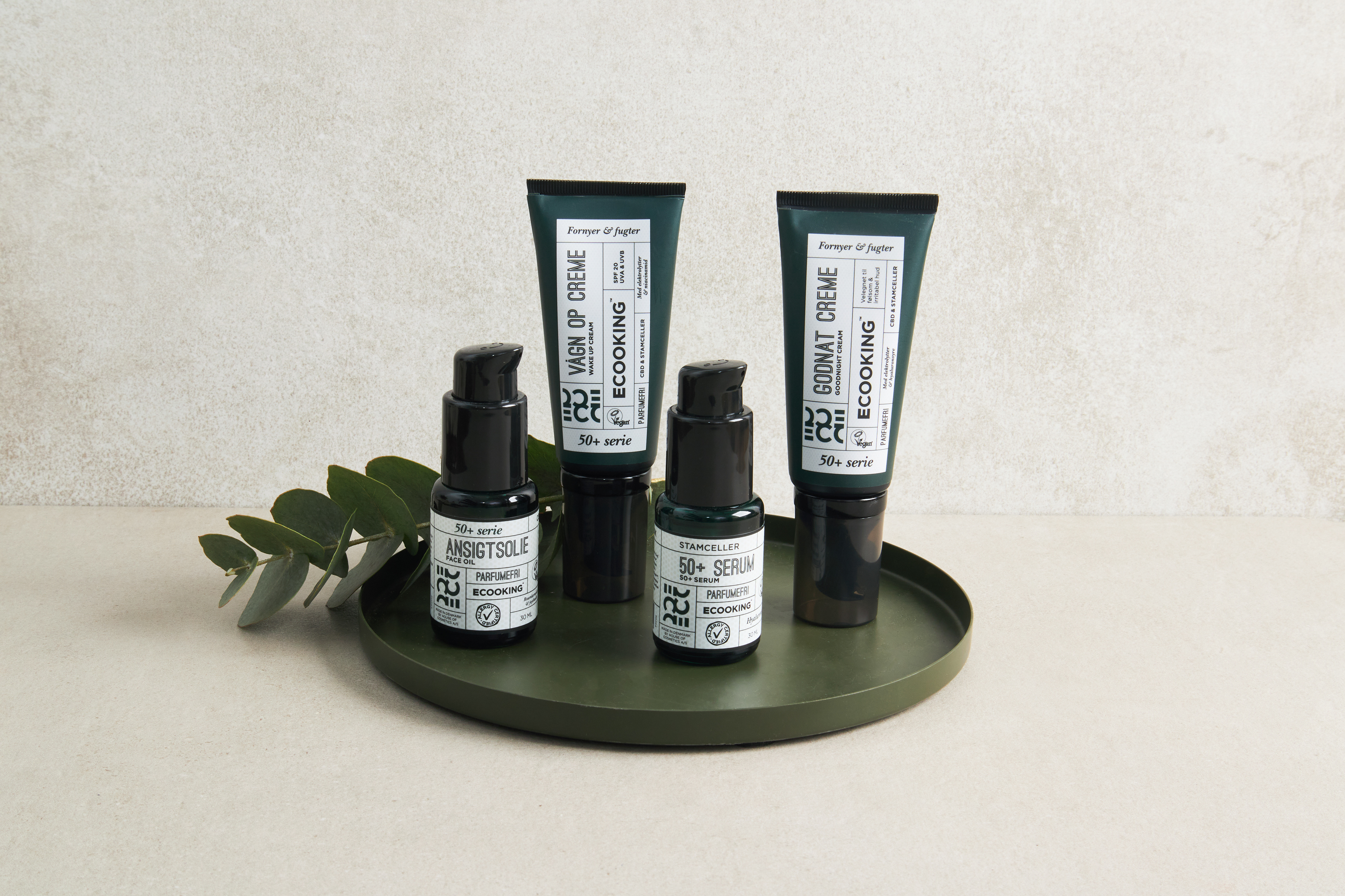
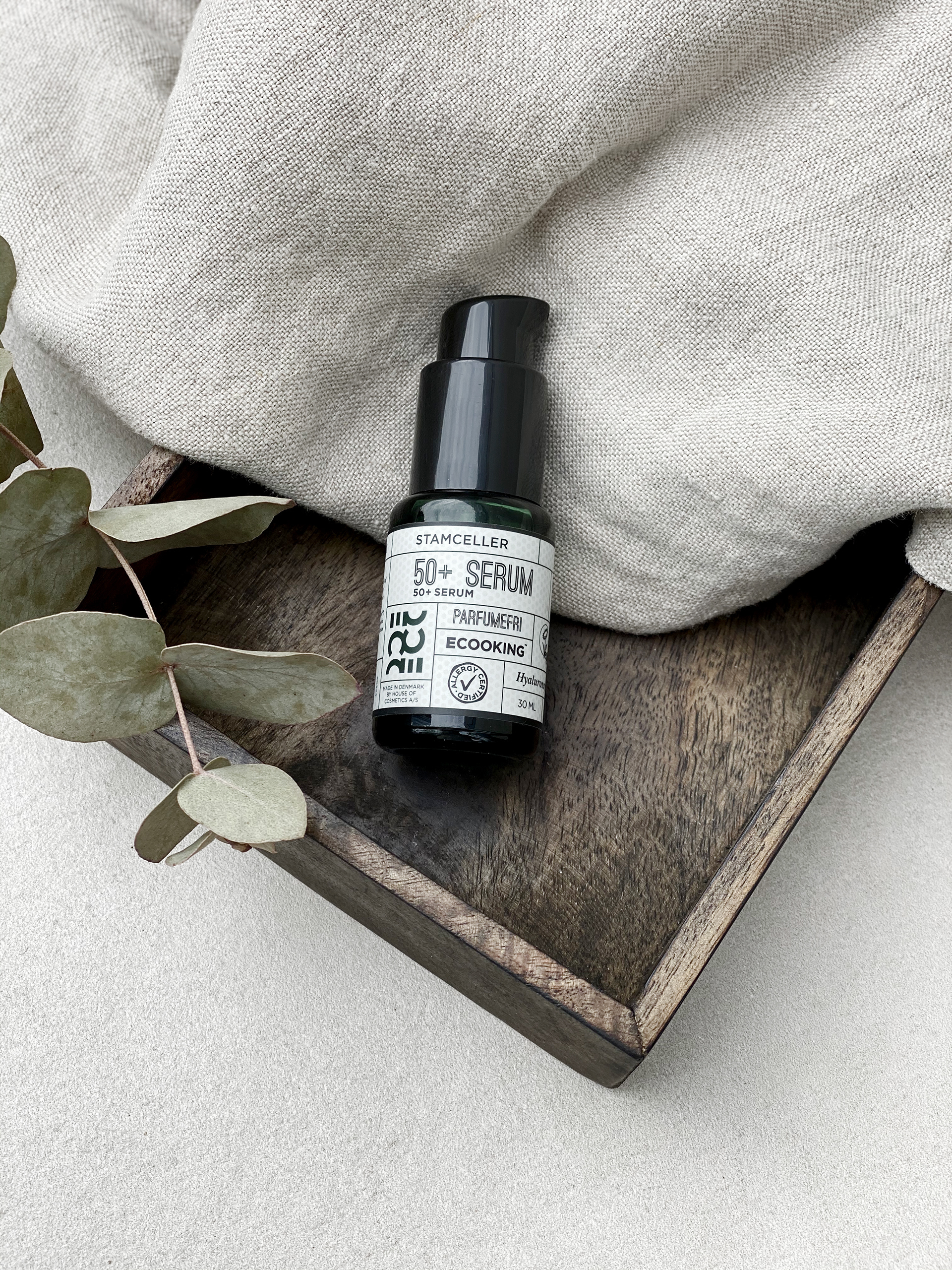
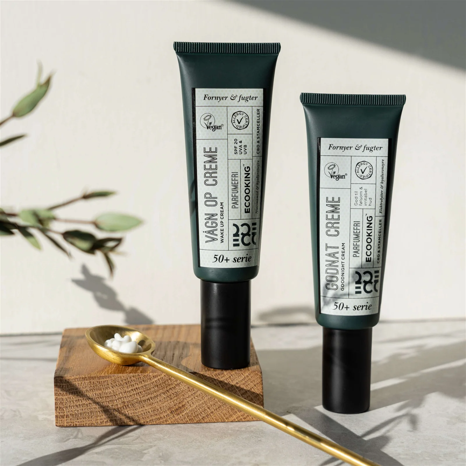
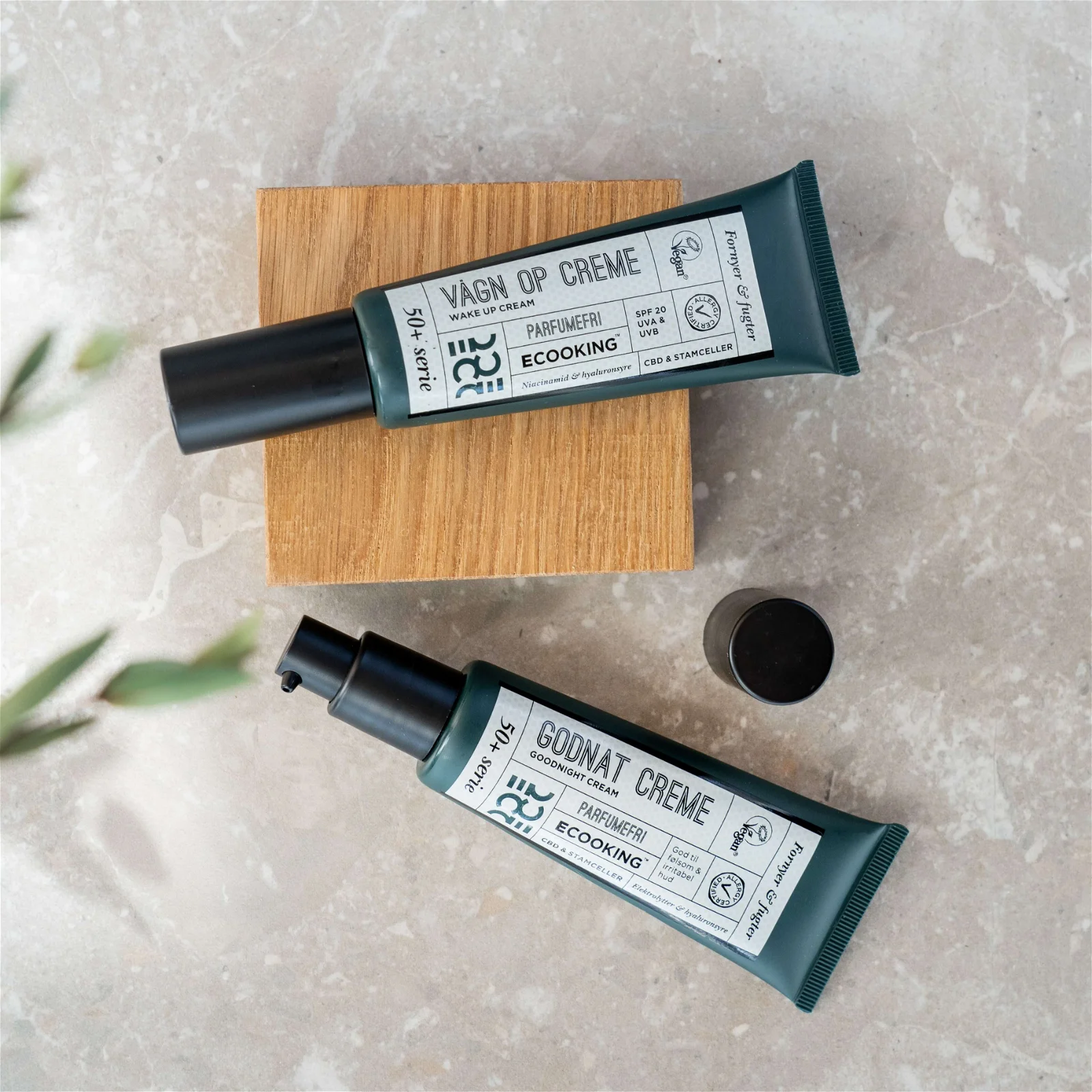
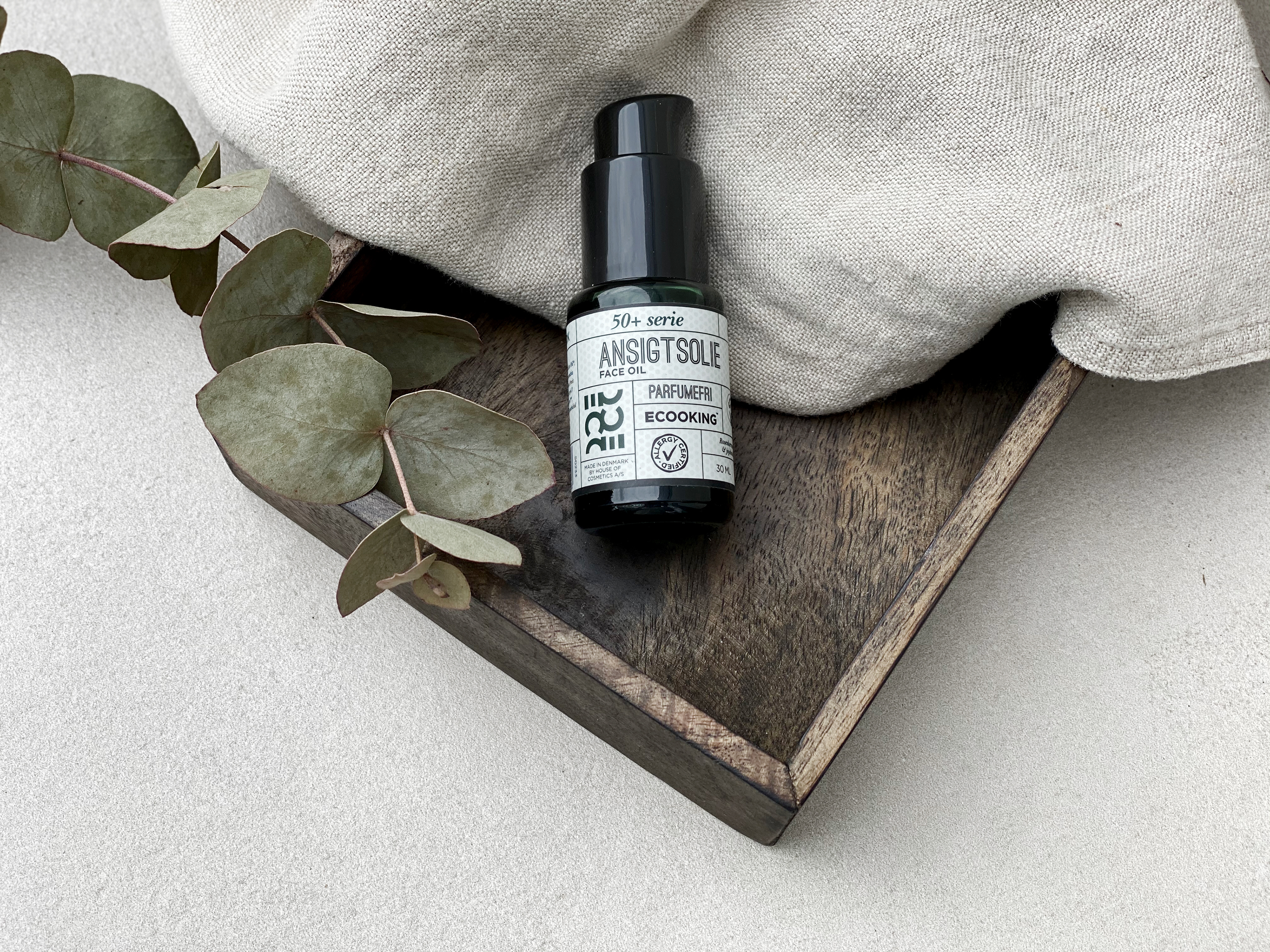
This is Ecooking's 50+ series consisting of a Face Oil, 50+ Serum, Wake Up Cream and a Good Night Cream. This products are designed for costumers above 50. First of all the names is easy to understand - fx the Wake Up Cream is for mornings when you wake up - pretty understandable. Then we have informative labels that gives you the information you need for using the product plus a little extra. All framed in a geometric grid that characterizes Ecookings visual identity.
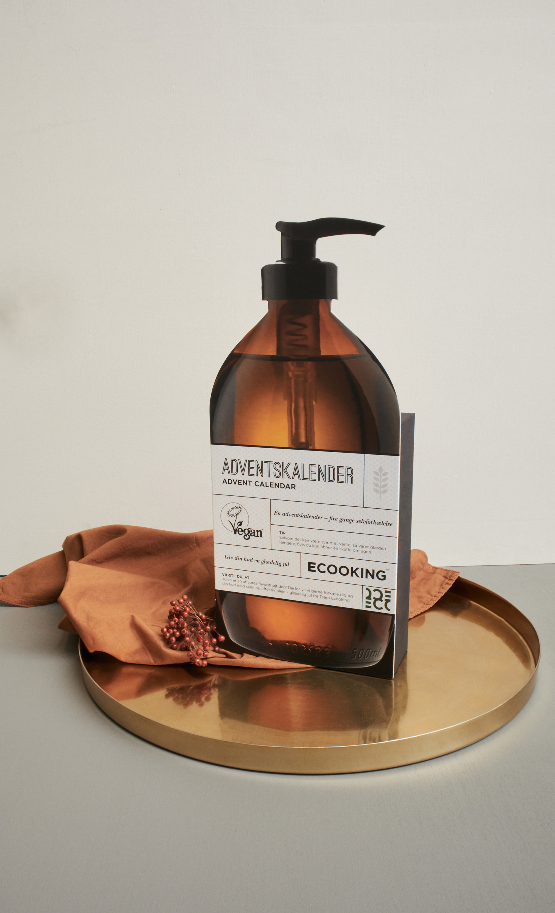
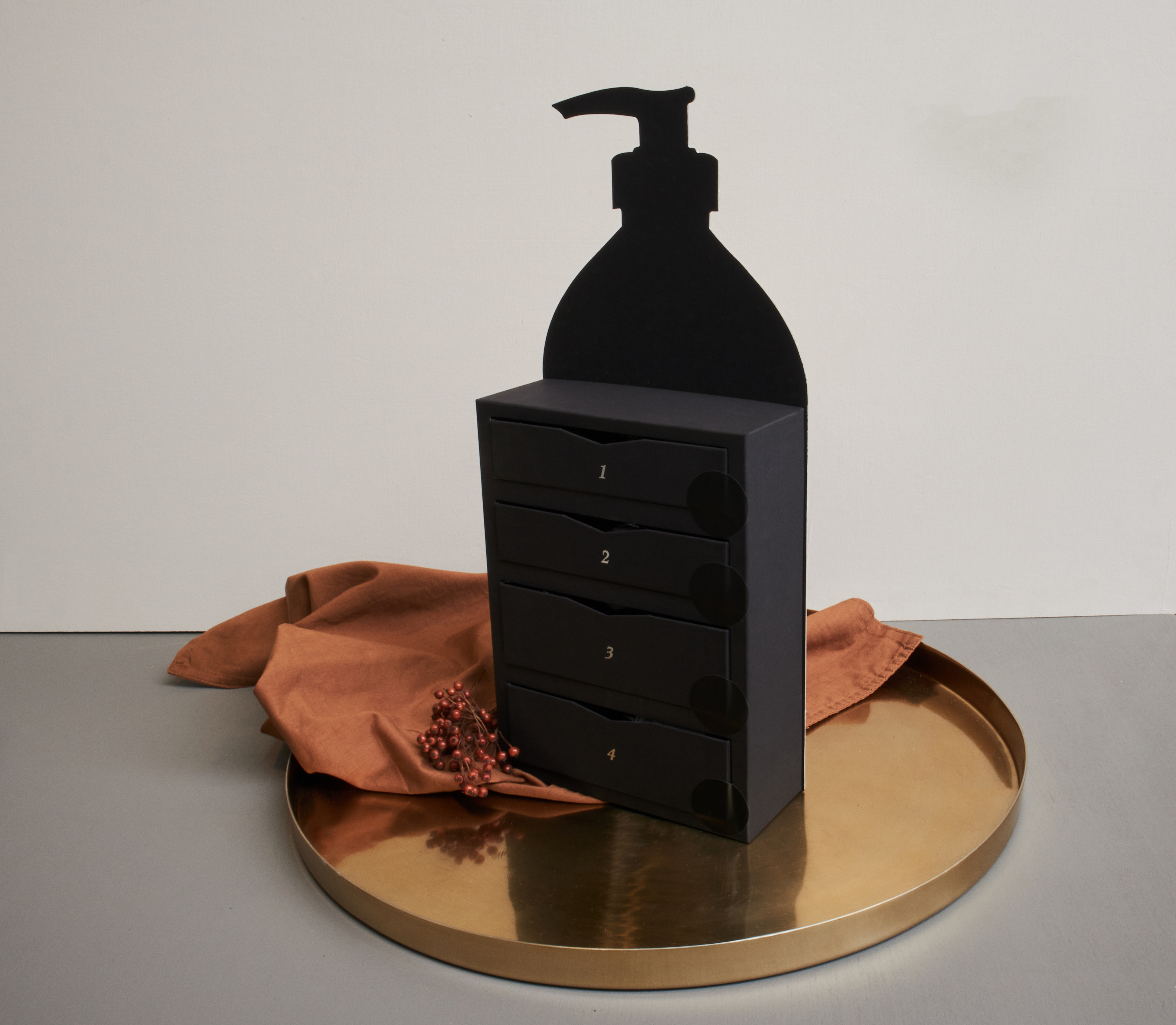
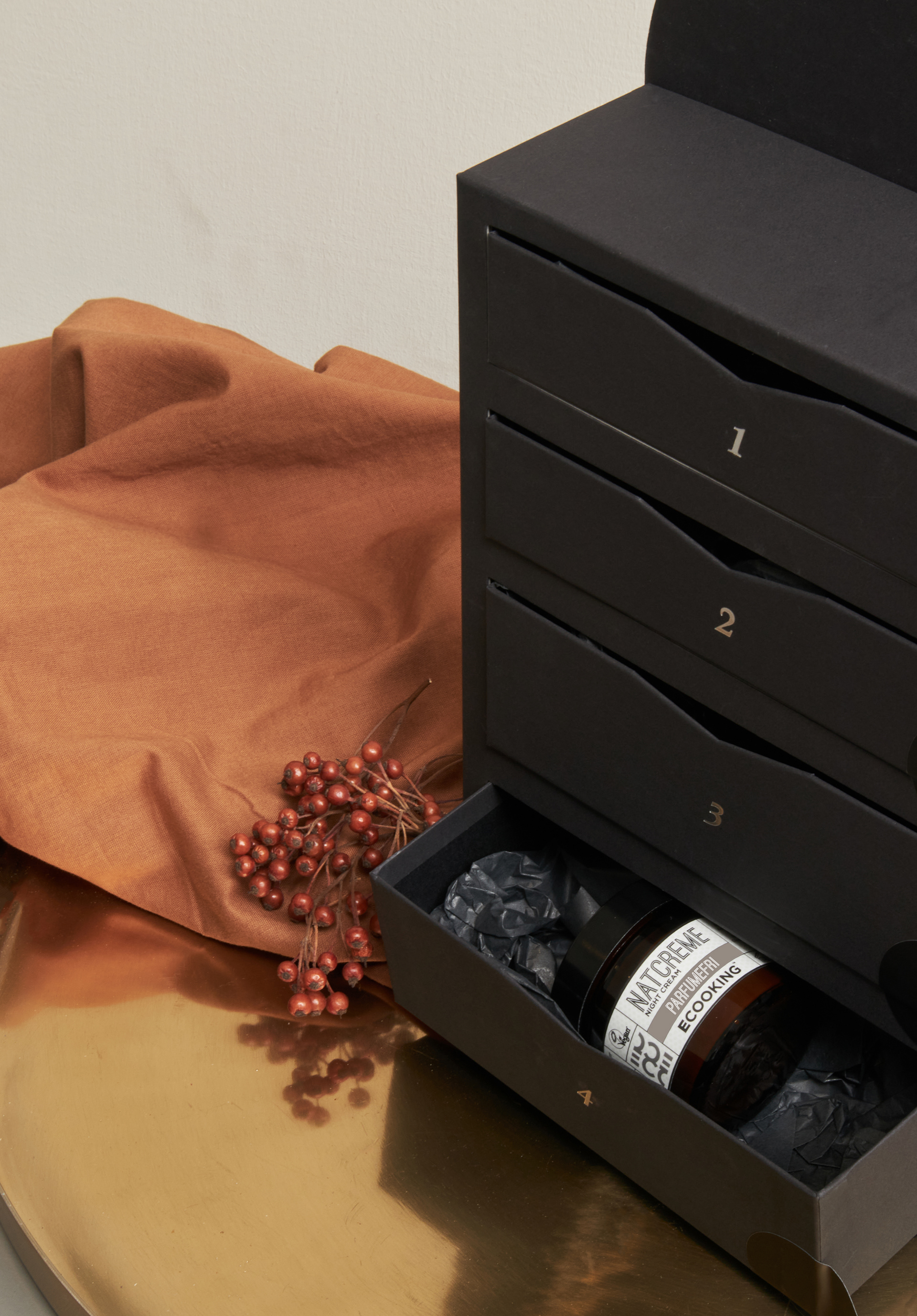
Below is the Christmas calendar of 2020. This advent calendar is designed as our Multi Oil in disguise with cheery Christmas vibes. In the back is 4 drawers with presents - 1 for each Sunday.
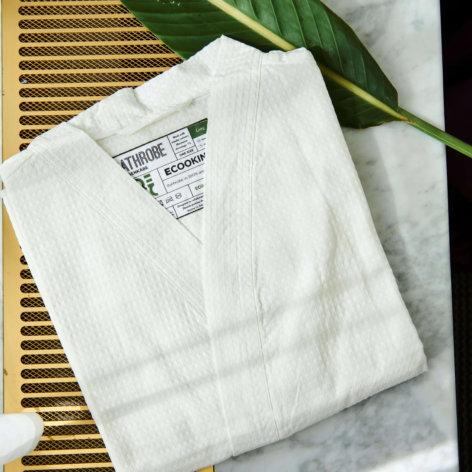
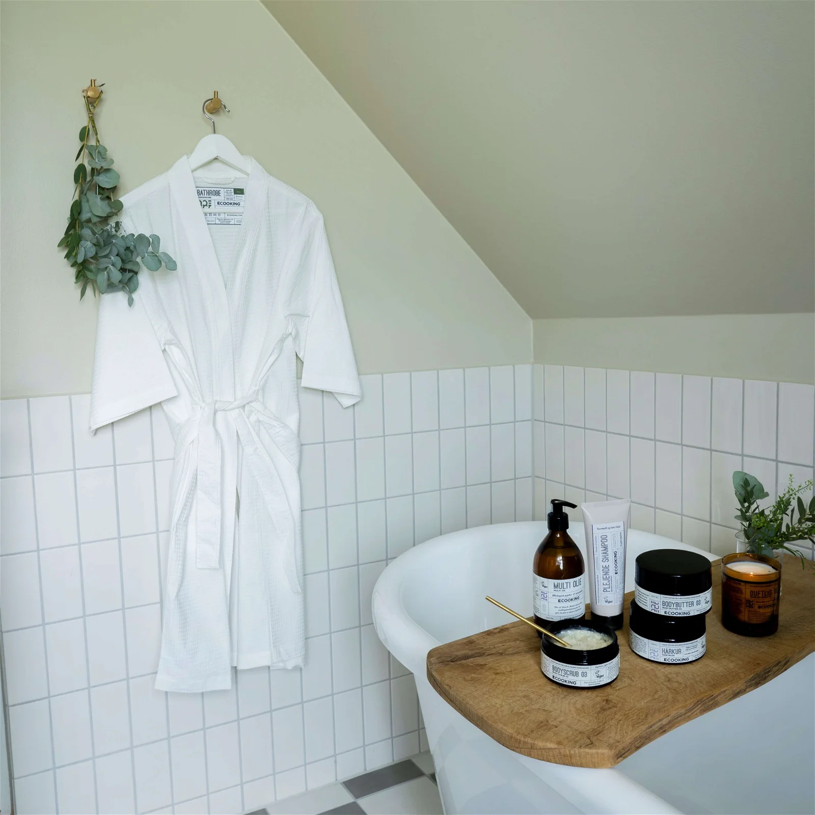
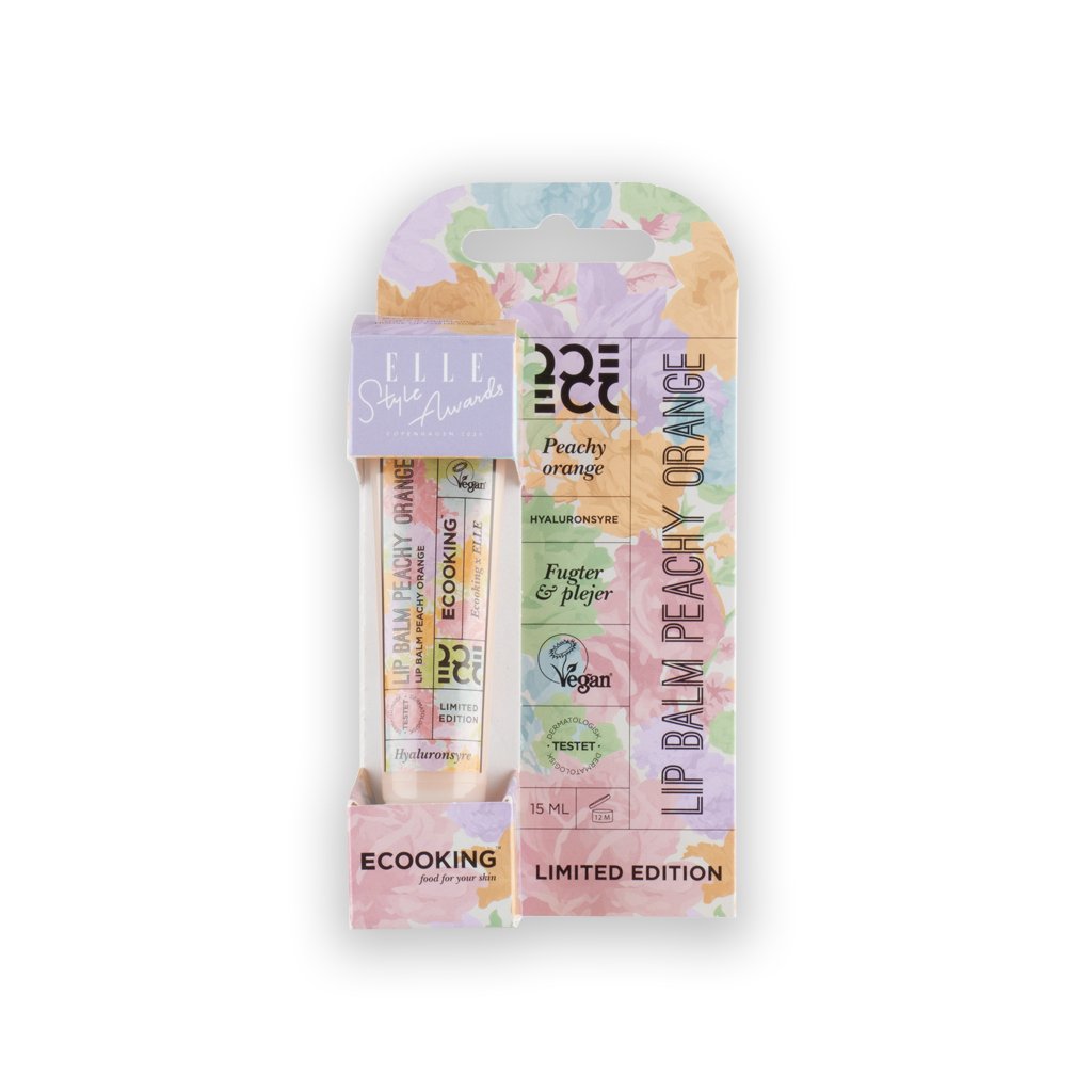
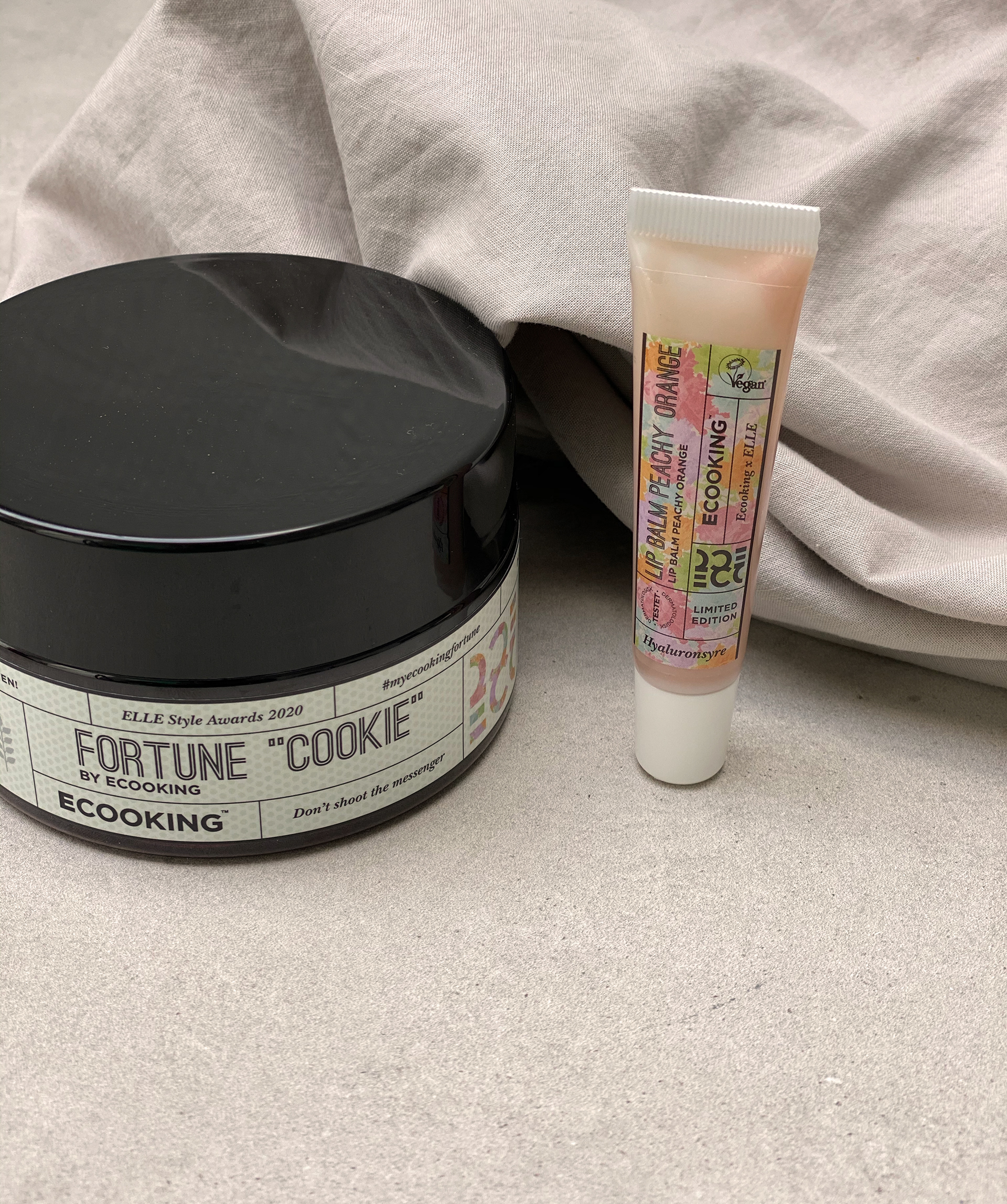
This is a Lip Balm that I’ve designed in collaboration with ELLE for ELLE Style Awards.
The design is a mix of Ecooking’s visual identity and ELLE Style Awards.
This year ESA use this floral print as a theme designed by the Danish fashion designer Stine Goya. The layout and the fonts is Ecooking and the floral print and the purple logo is ELLE Style Awards. All elements combined is the 2020 expression of Ecooking X ELLE Style Awards.
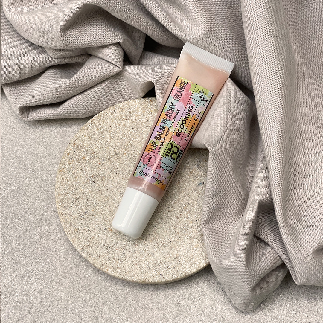
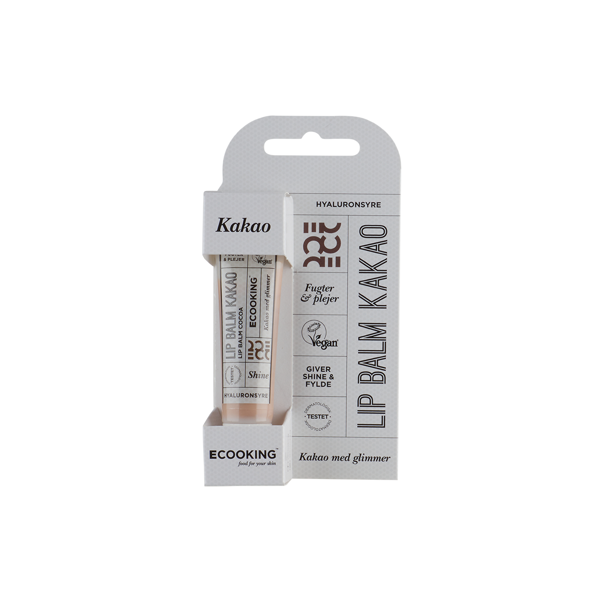
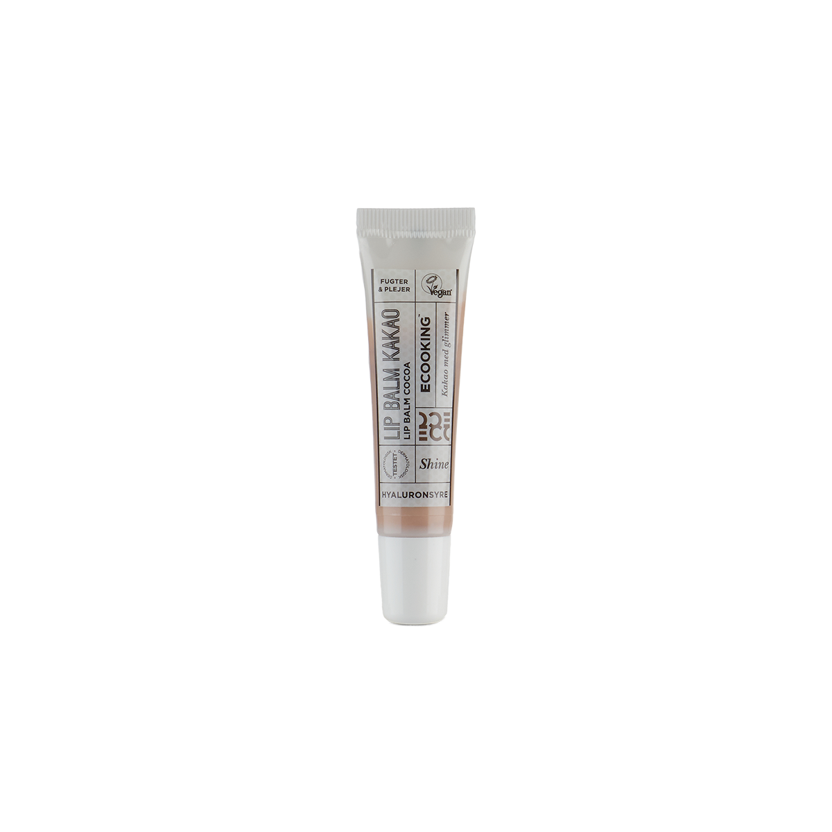
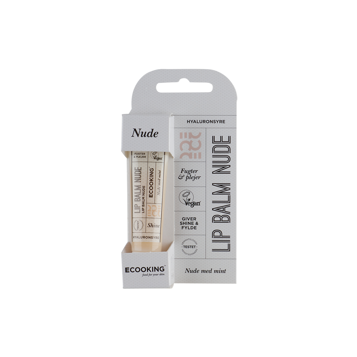
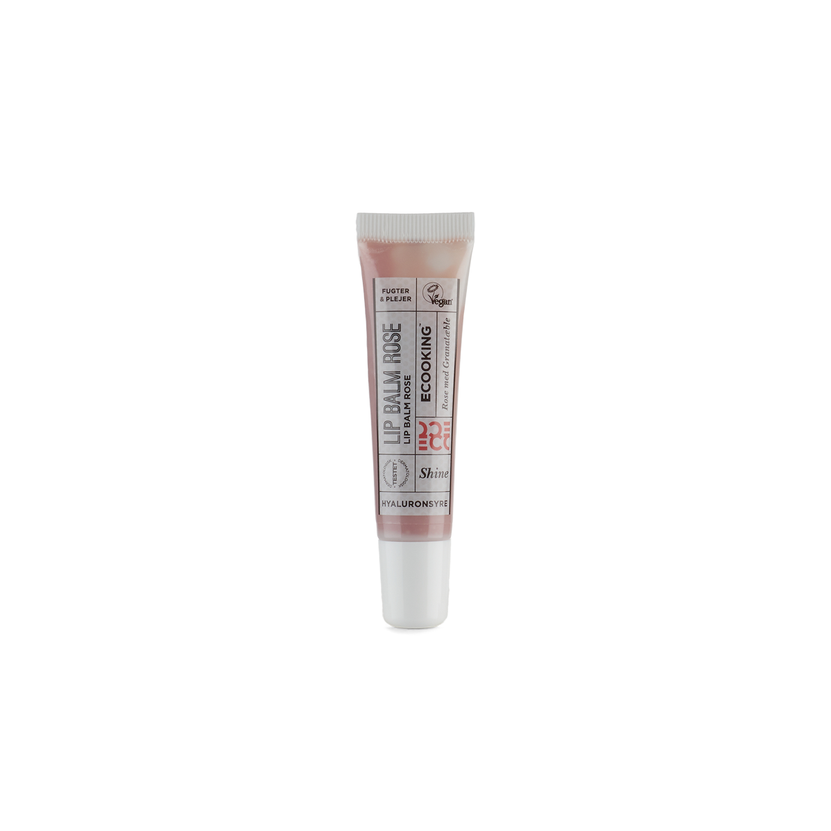
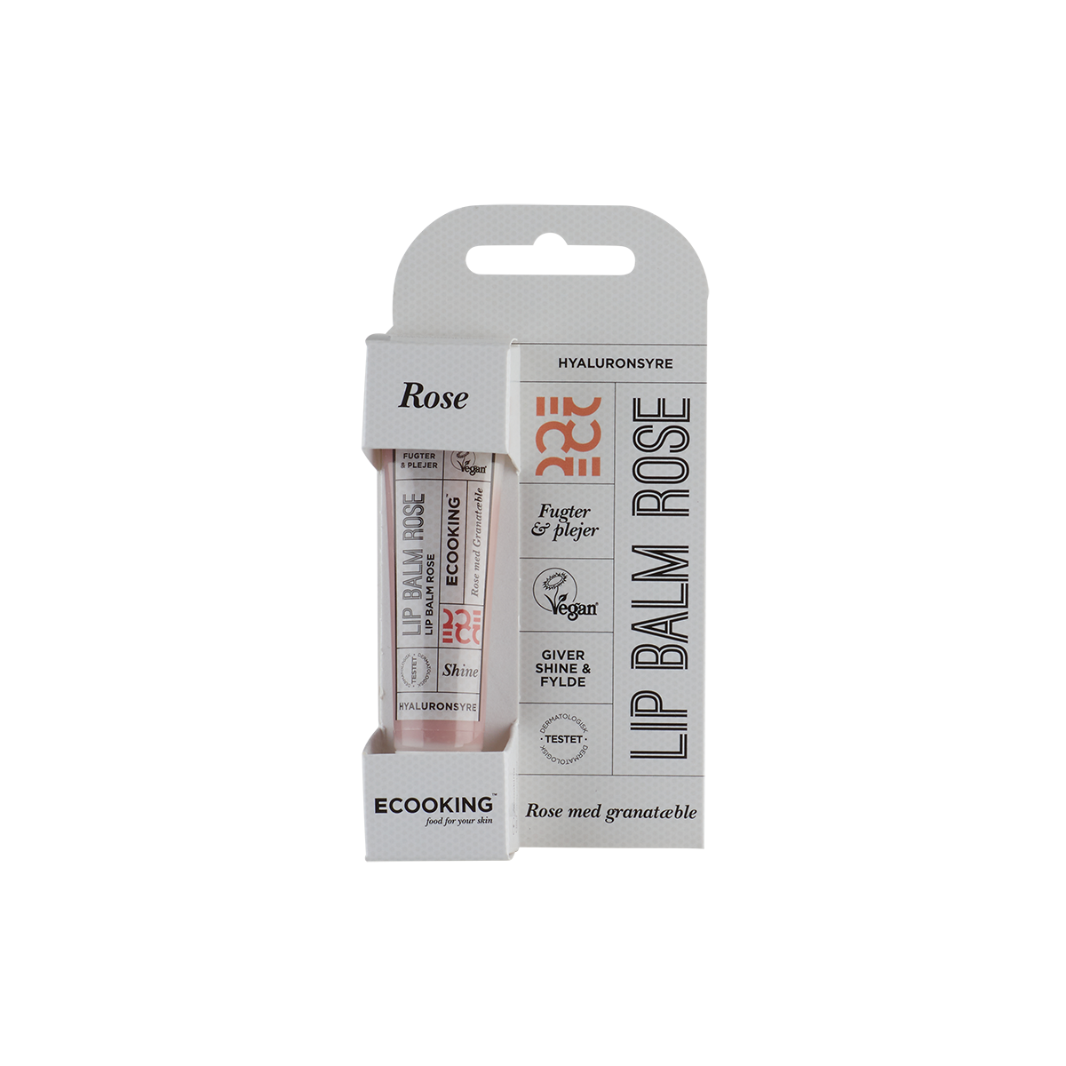
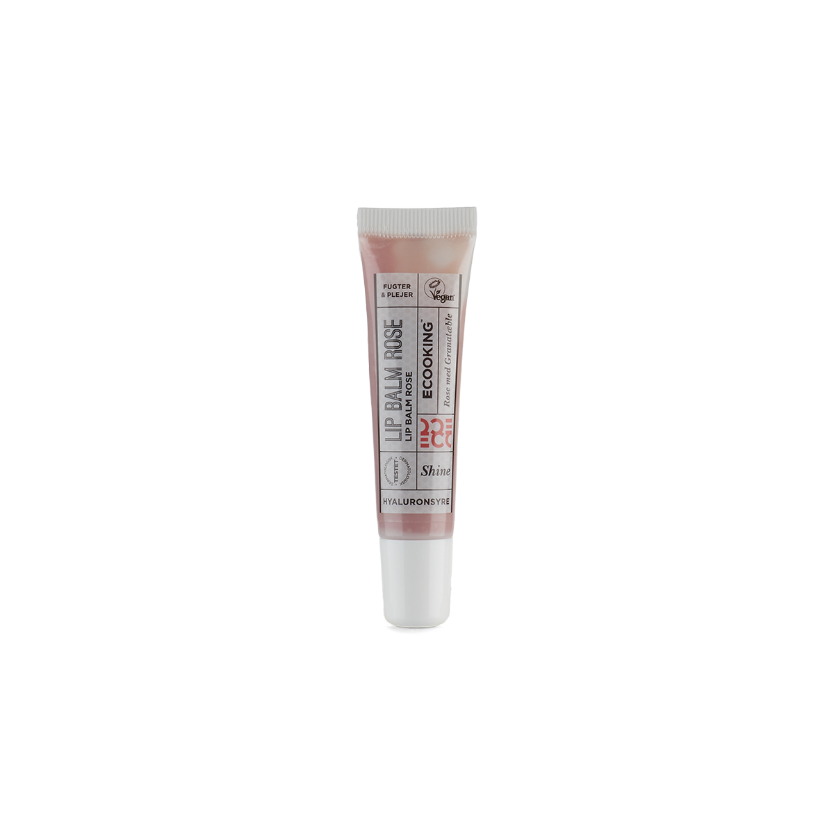
Here's a line of Lip Balms in 3 different colours.
This is one of many posters that I've made for Matas's stores.
The key to the Eccoking look is a nice grid, dots, green colours and a quote from Tina, the owner.
The key to the Eccoking look is a nice grid, dots, green colours and a quote from Tina, the owner.
Below is two newsletters that I have designed.


This project below is fictional project that I made for a job interview.
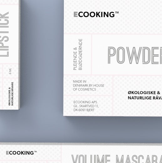
If ECOOKING should launch a makeup line. How would it look like?
I looked at ECOOKING's visual design and copied the characteristic elements; dots, boxes, lines, the font, into my new design, so I keep the brand identity. By using a pink pasel colour I've created a feminine universe so it appeals to women who is the main target group of make up.
